03.19.26
Above the Fold: A Poster Project for a Divided Country
A four year journey into the depths of partisan news, bias, and polarization.
I’m a 45 year old graphic designer that lives in New York City, and my news consumption habits are probably not all that surprising. I still read the New York Times newspaper. I love the smell of it, the feel of it. I listen to podcasts like The Headlines, The Daily, and Hard Fork on the way to work. I watch the Today Show on NBC every morning, a tradition I’ve kept since I was in a highchair at the breakfast table in Martinsville, Virginia in the early 80s. I scroll through Instagram during the day, and between vintage guitar videos and SNL skits, I’ll get the latest and greatest on how Trump is fucking everything up.
We are a decade into this fever dream and I continue to wonder why half of this country is so firmly behind him. People I grew up with. Many of my neighbors in Rockaway (ask me later about the Kamala/Trump flag battle I had with some folks on my block). The nation is divided. Communities are divided. Us or them. These aren’t bad people. These aren’t dumb people. Misguided and misinformed – maybe. But, I’m also the target of untruths and misinformation. I think the key difference is that the reporting that I gravitate towards typically maintains a sense of empathy for others.
During my lifetime, I’ve seen the news mutate from a shared national experience to an infinite personalized feed. Culturally and politically, this has had sweeping effects. It has ushered in an authoritarian strongman at the helm of our country and fractured our common ground as a population. Algorithms drive us further apart and entrench us on opposing sides of a clickbait culture war. Misinformation runs rampant through our devices and burrows deep in our collective psyche, pushing our trust of what we see and hear to an all-time low.
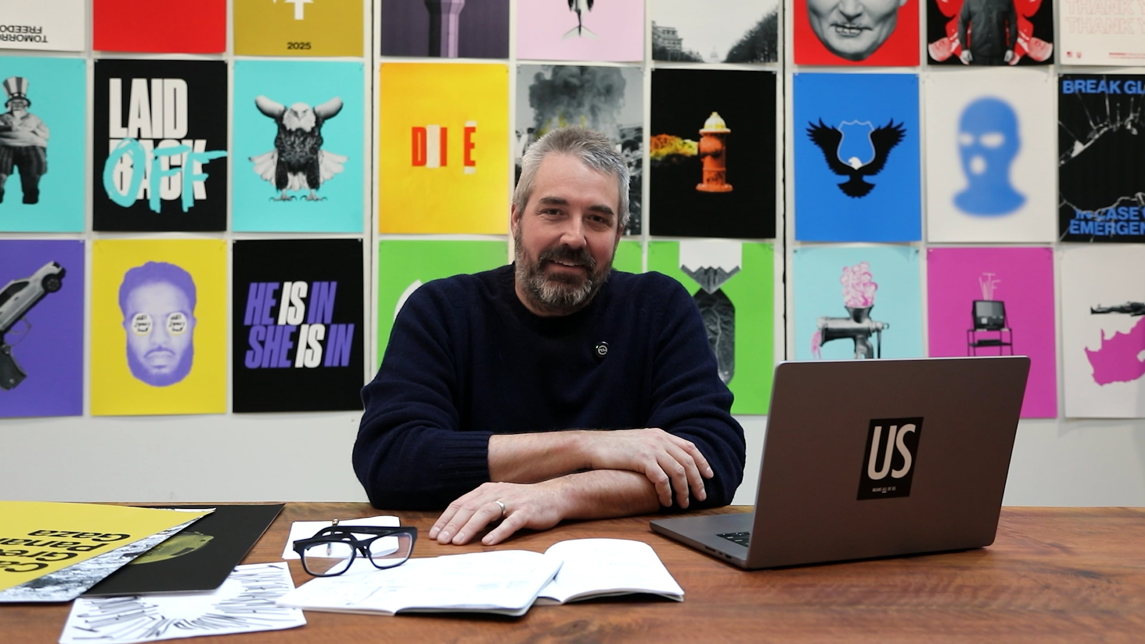
As a graphic designer, I interpret the world through color, type, scale, and image. I look to solve problems and communicate with those tools. My career began with a project called BBCx365 where I designed a poster a day for a year based on BBC news articles, hoping to increase Americans’ understanding of global current events.
Now, 15 years later, I’m revisiting the spirit of that project in the context of today’s news habits, polarization, and bias. For this new project, NewsX365, I’m designing a set of 3 posters every week of Trump’s second term. I’m looking at how MS Now, the Associated Press, and FOX News frame their reporting on the same stories. So, 3 posters a week for (hopefully just) 4 years, will net out at 624 posters.
At the time of writing this, I’m 3 months into the second year. There’s no shortage of divisive stories to capture, and I hope this project appeals to the left and the right. Showing multiple perspectives is important to understanding the total picture, so I approach it with an open mind and try to design graphics that portray the story in the particular light that it’s framed in. This all flows through the brain and hands of a liberal graphic designer from NYC, and that point is not lost on me. I understand the bias that I bring to this.
At the end of the 4 years, I imagine this project will serve more as a time capsule than a survey of media bias, but regardless, it will certainly capture a dark and historic chapter in our modern American history. A graphic meditation on the swelling tides of chaos and division brought on by a tyrant who pushed our democracy to its breaking point.
MORE NEWS