The conceptual 100-meter dash
It’s a rush of adrenaline. A quickfire test of conceptual acumen. As Liam Neeson would say, “a very particular set of skills.” The editorial illustration is the most acute representation of the creative sprint. It tests what you’re made of. You have to think smart and work fast as hell. We love the challenge.
Client
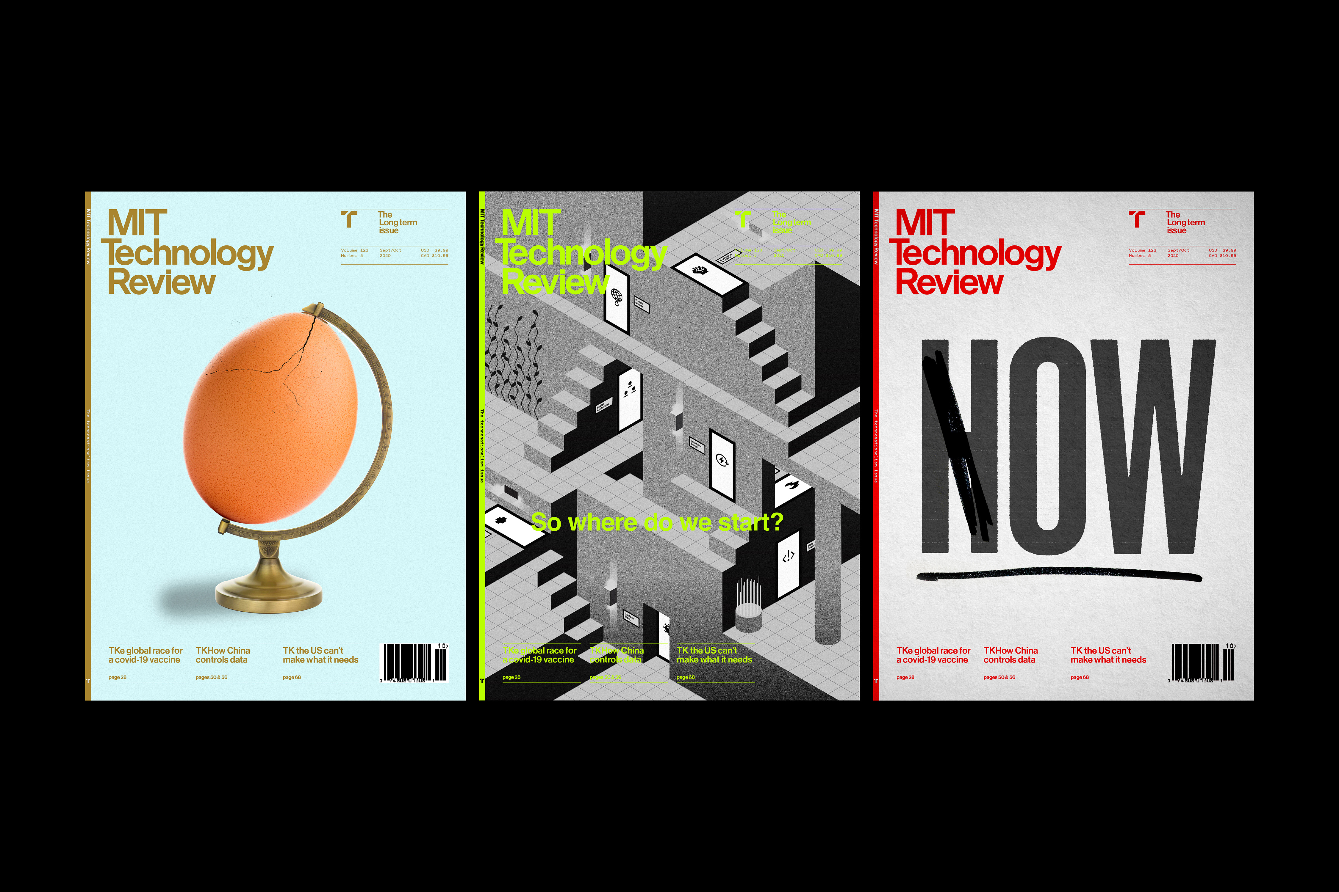
New York Times, MIT Tech Review, Fortune Mag, BBC
Project
Editorial Illustration
Tags
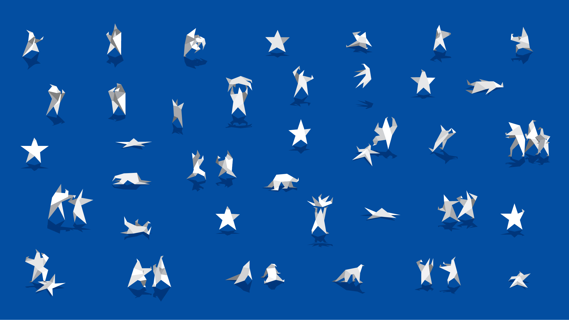
Political Party Meltdown The New York Times
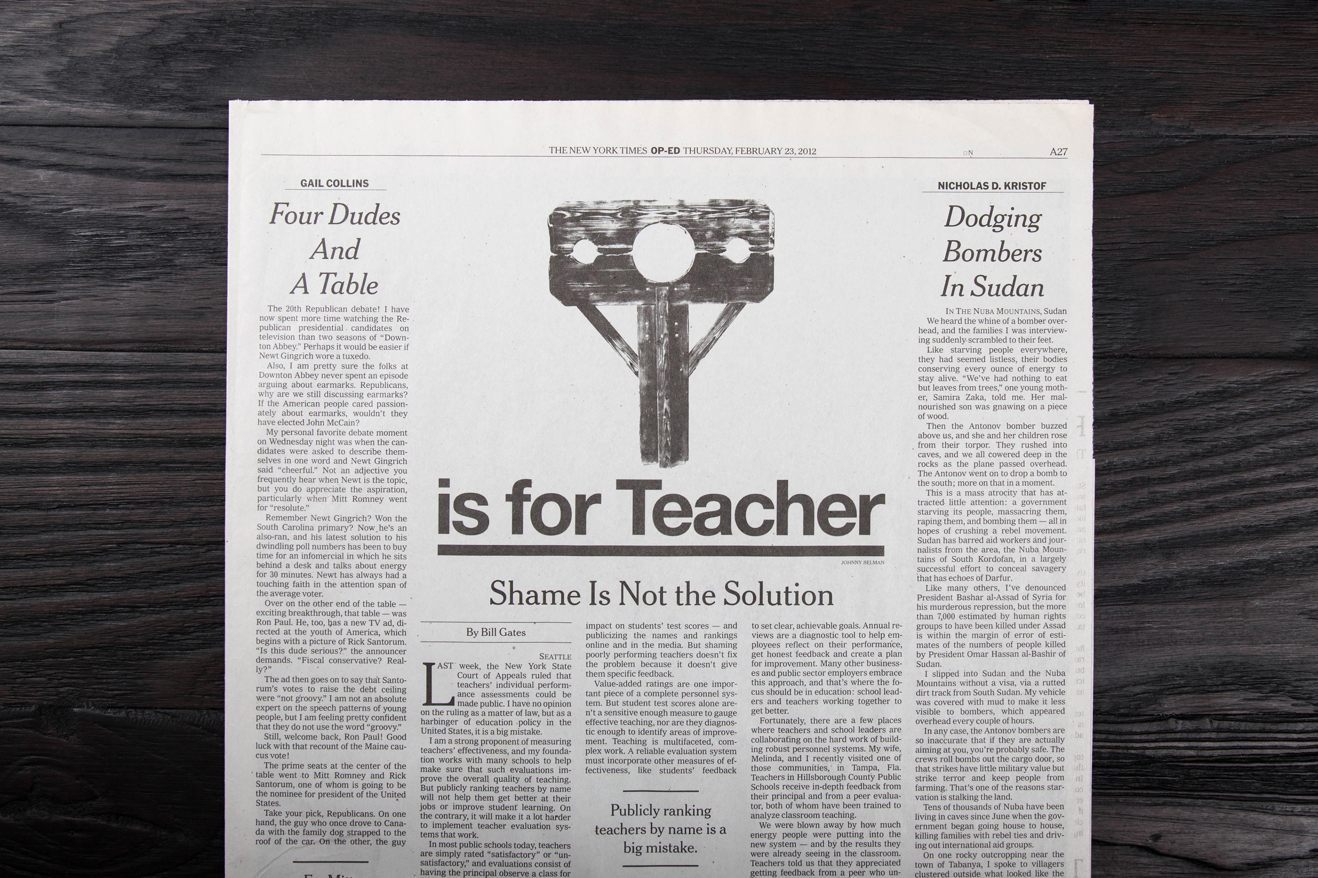
Shame is not the Solution The New York Times
Distill
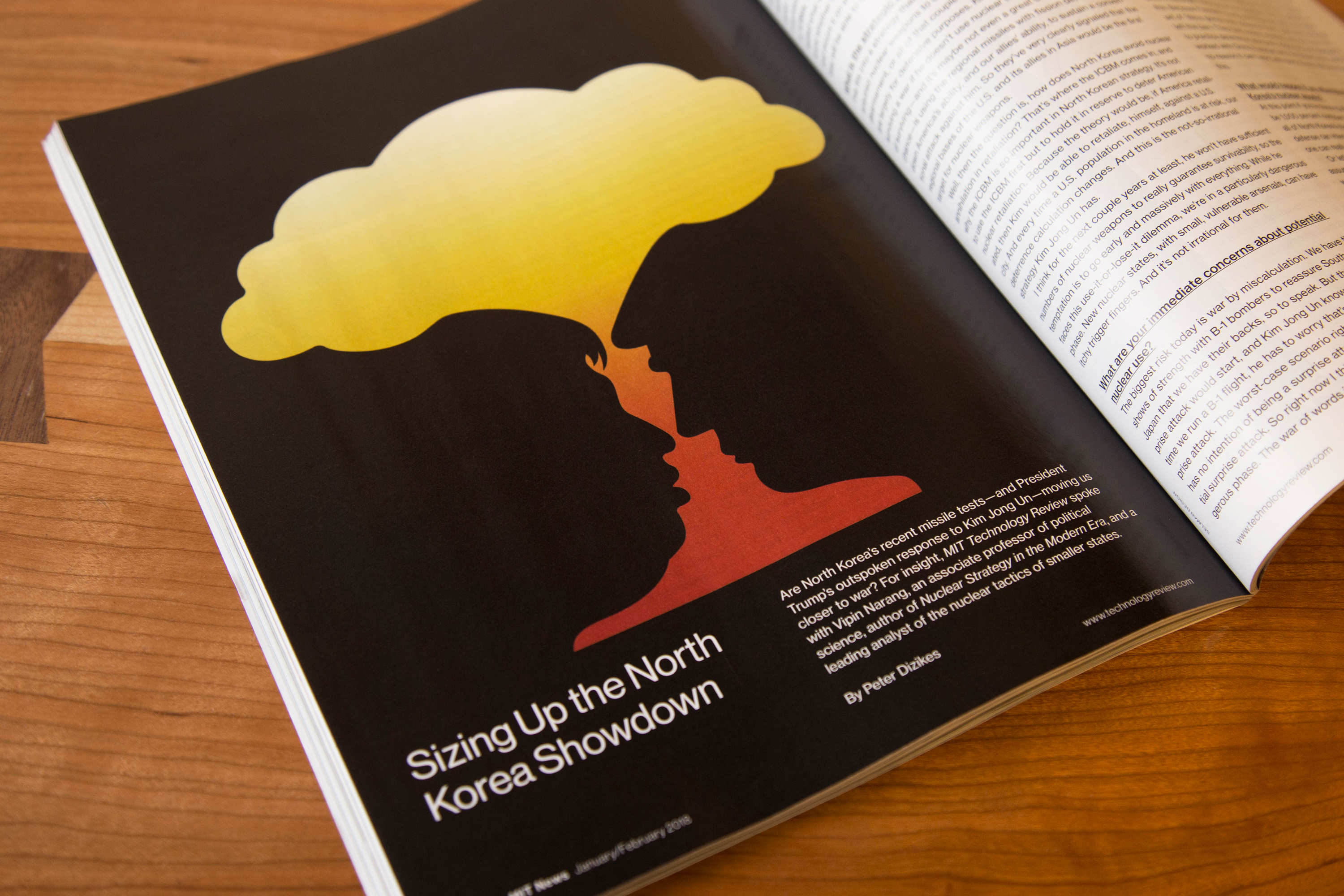
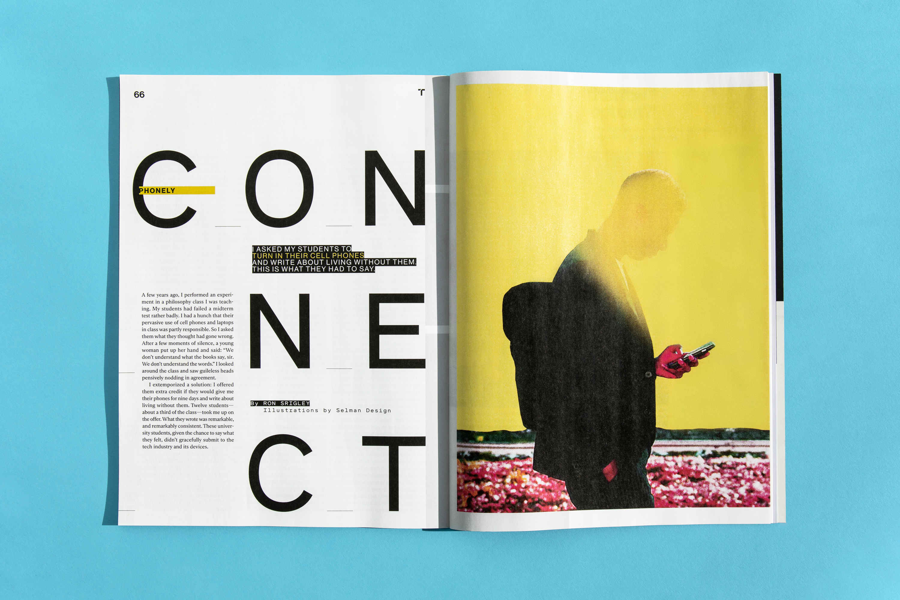
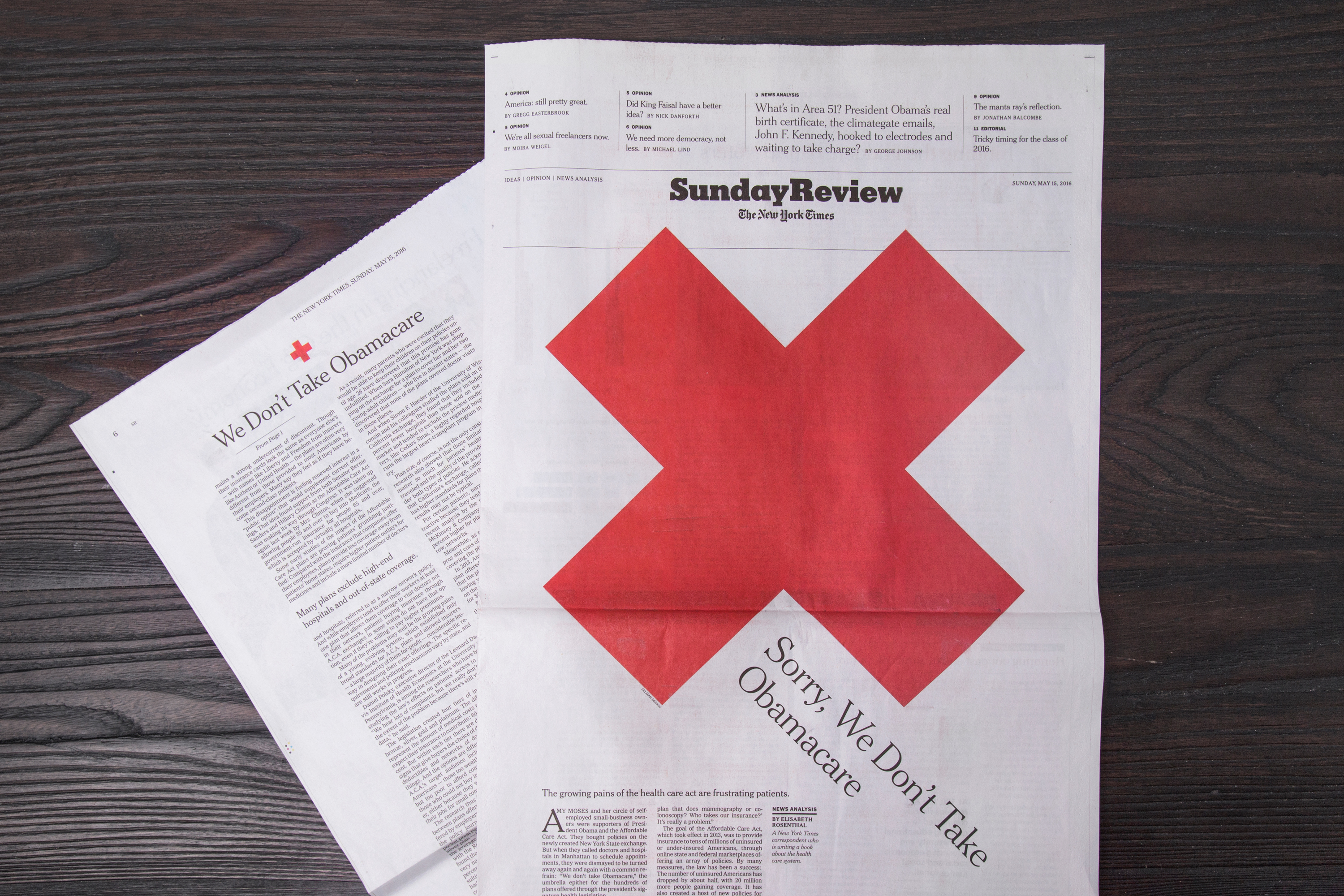
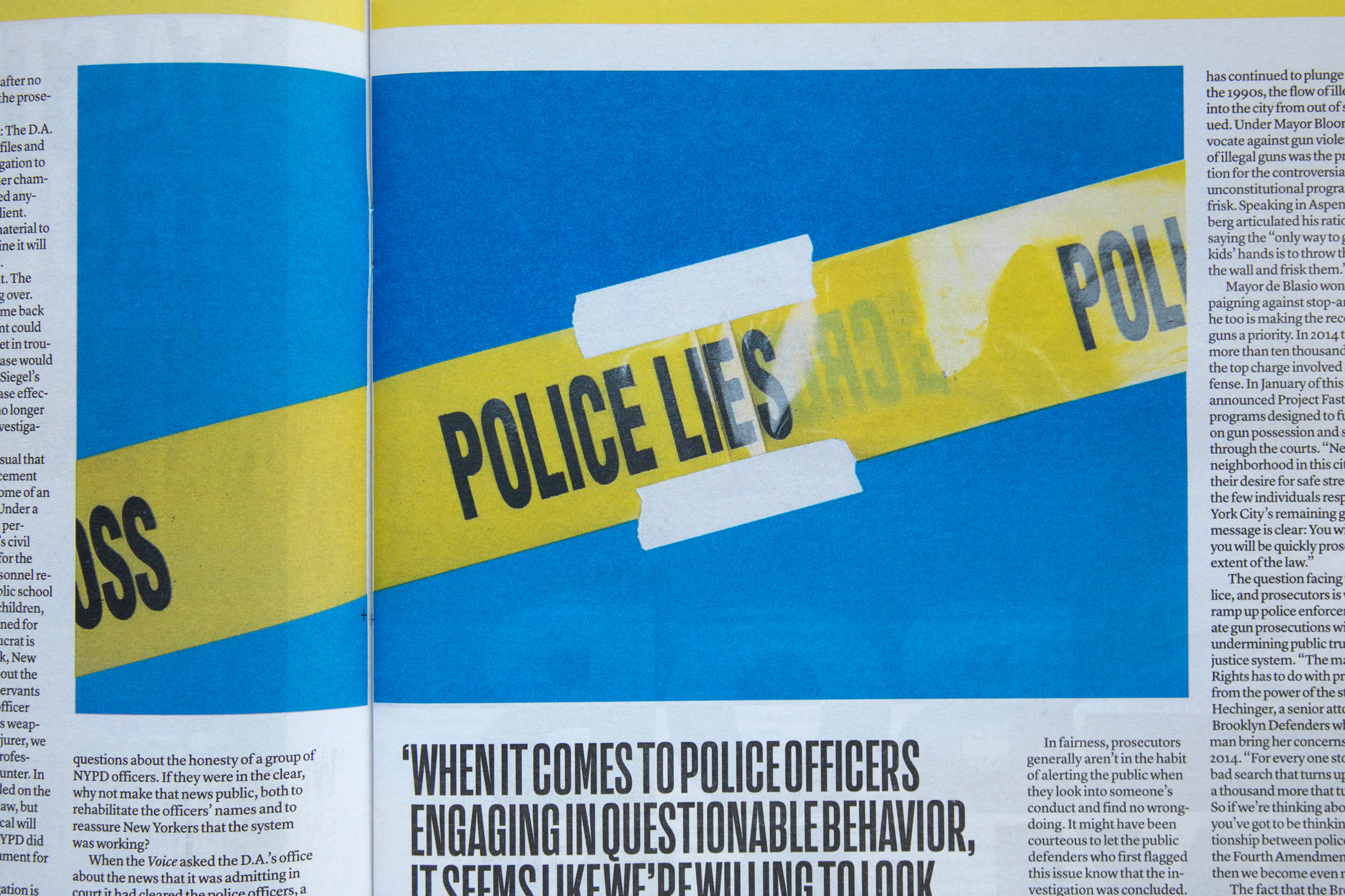
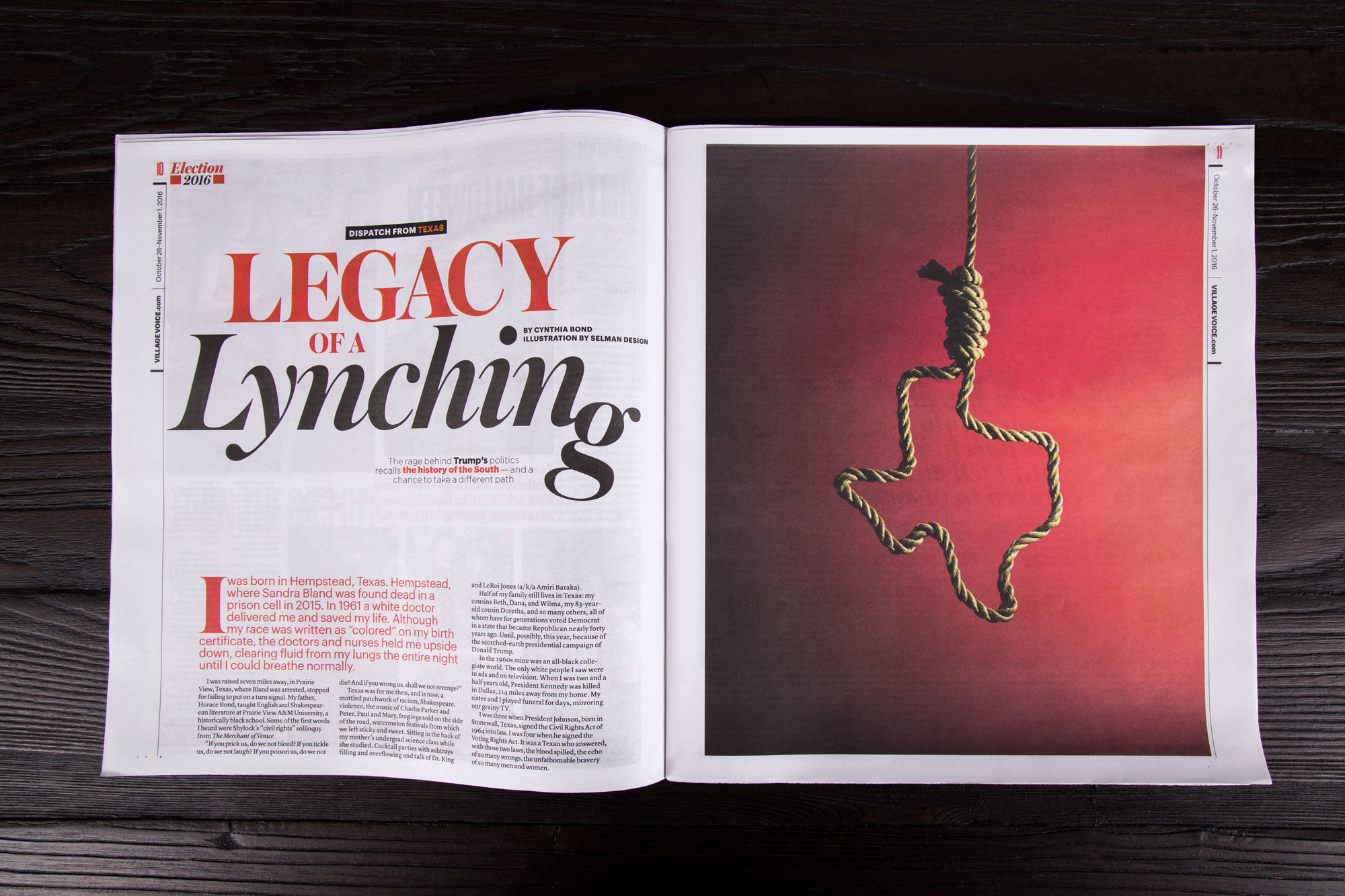
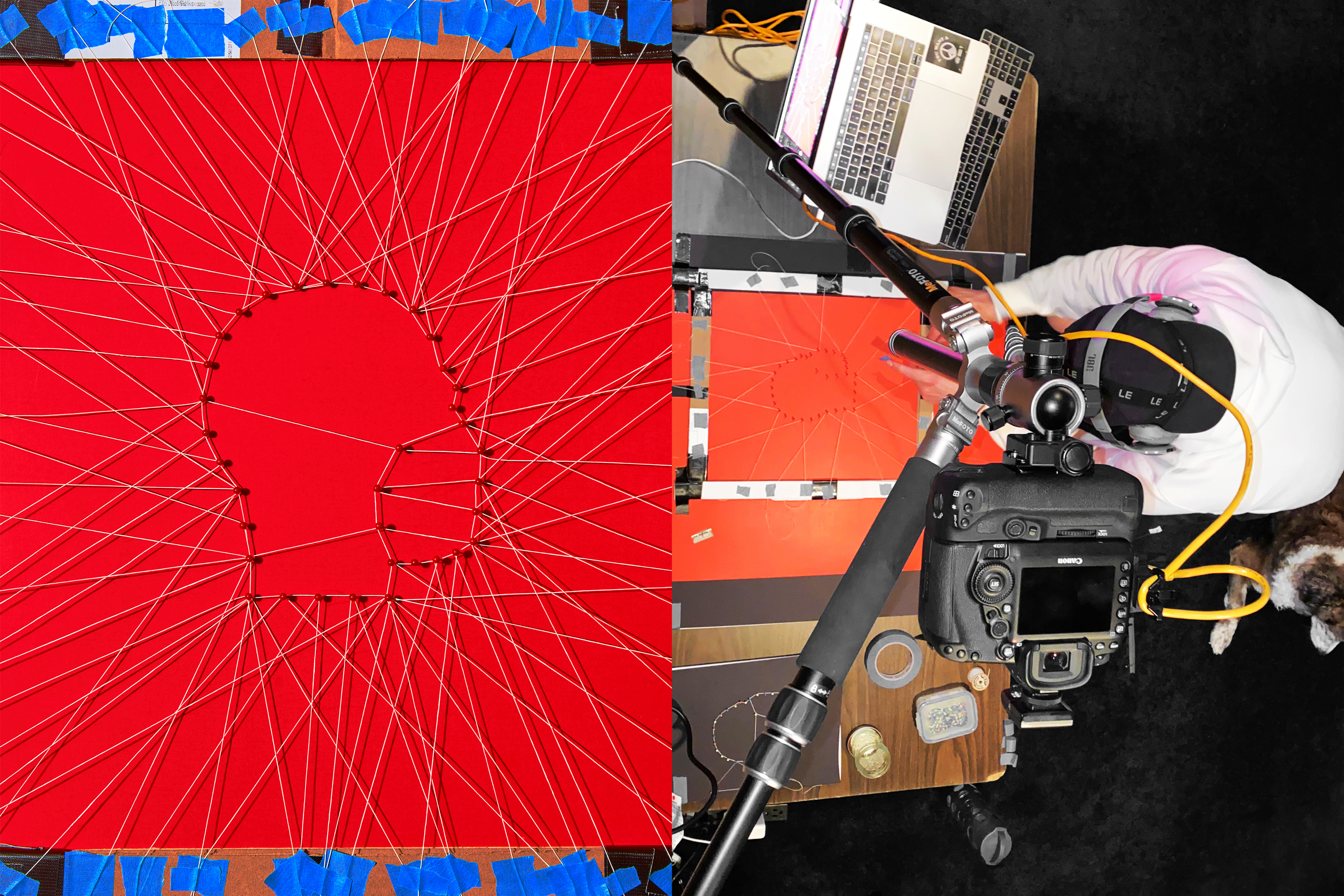
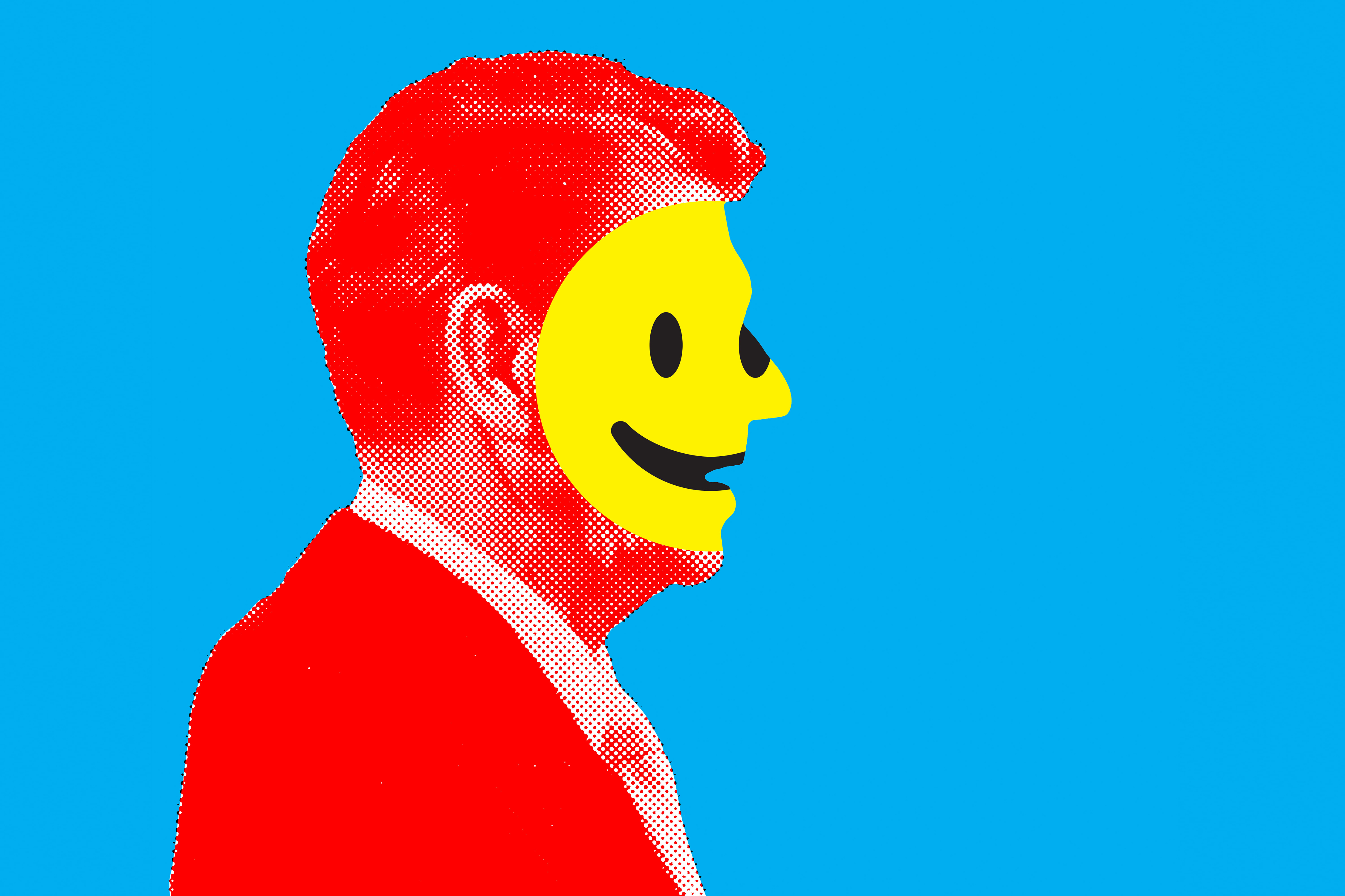
At their best, editorial illustrations are a thought-provoking entry point to the content of an article. They elevate the intent of the author through a clever visual twist or provocative juxtaposition. They repurpose common symbols to tell a layered visual story. Our goal with these assignments is first to extract the article’s essence and then shape it into a compelling piece of art.
Credits
[CURRENT]/[TOTAL]
Sketch
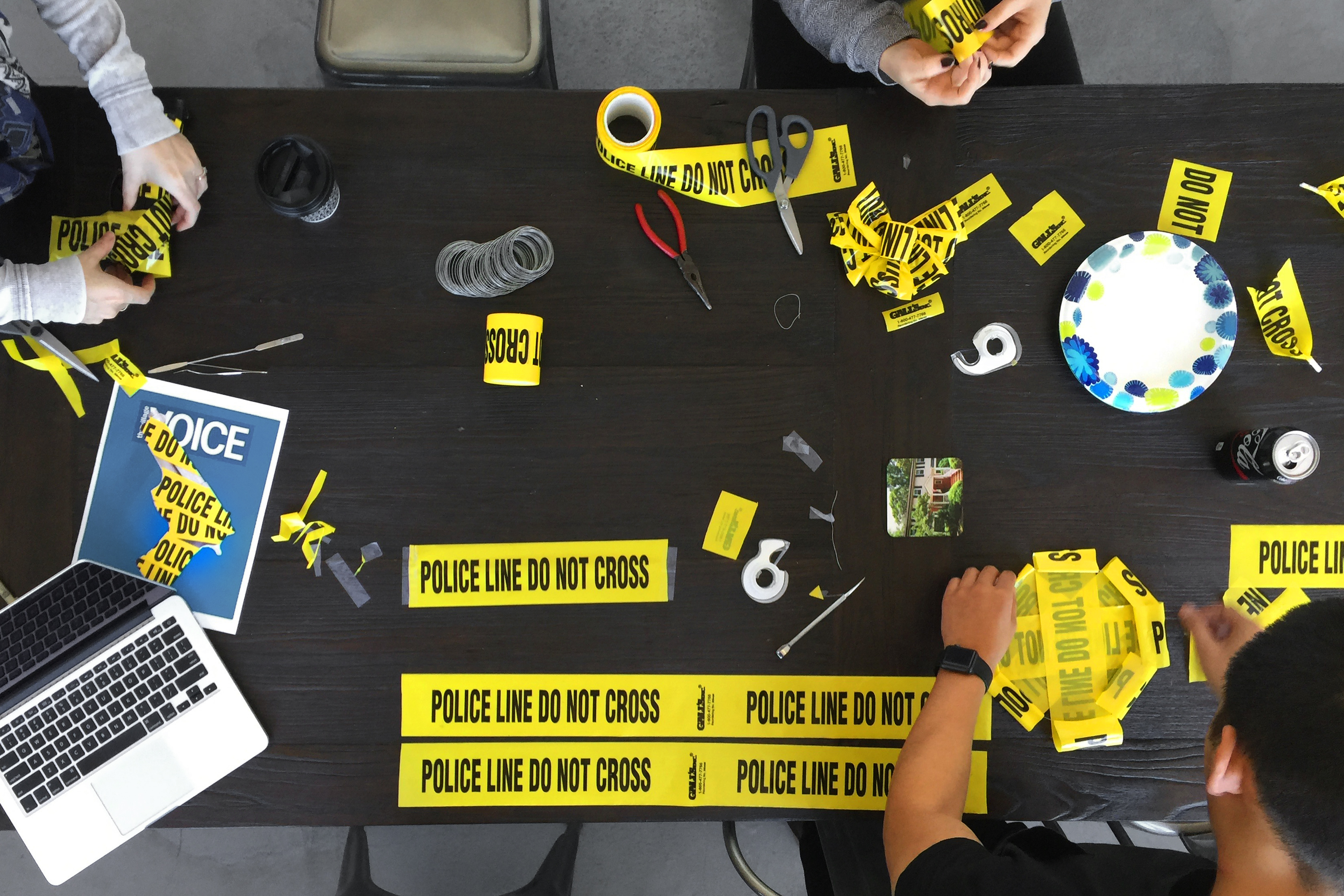
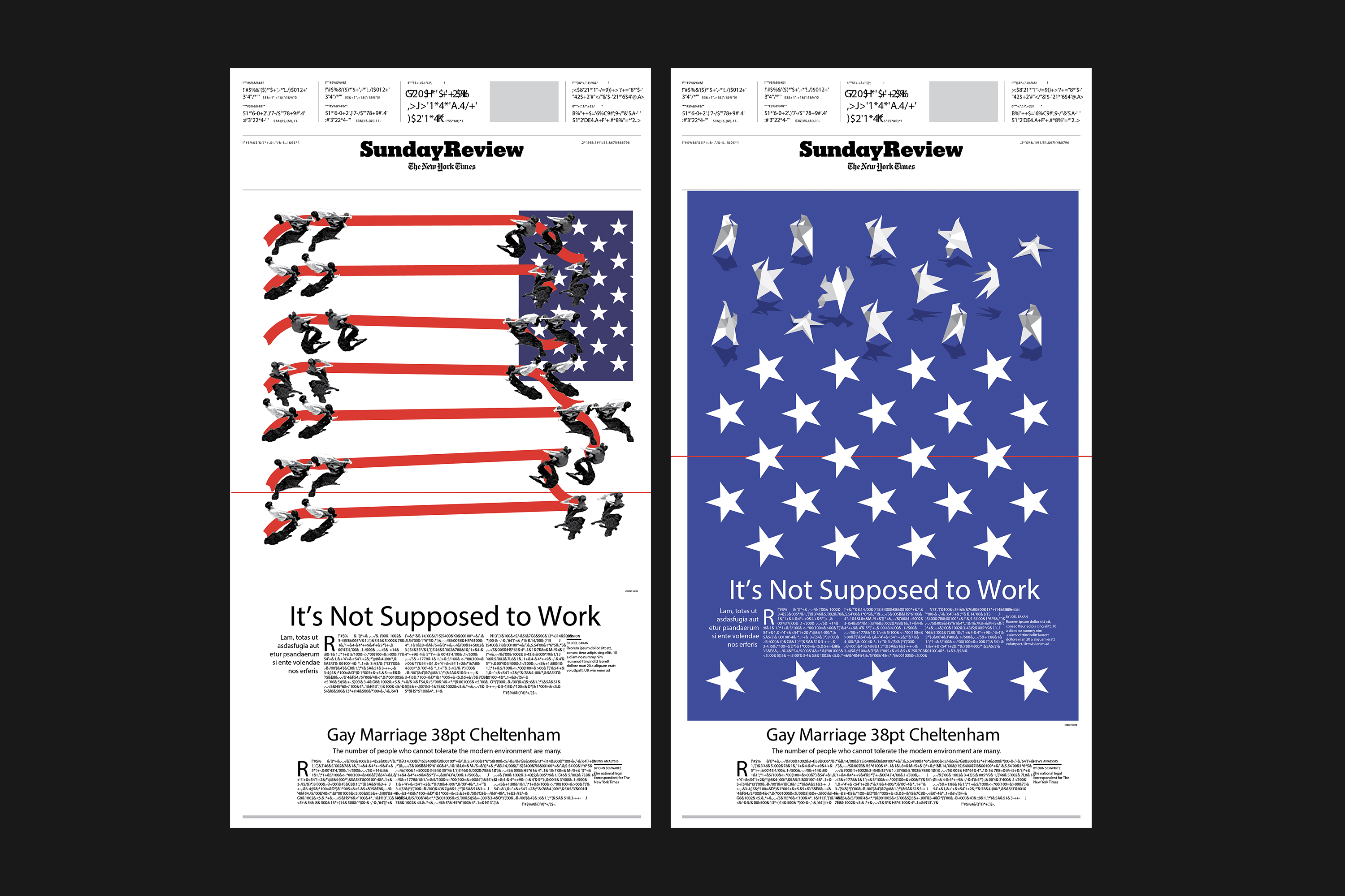
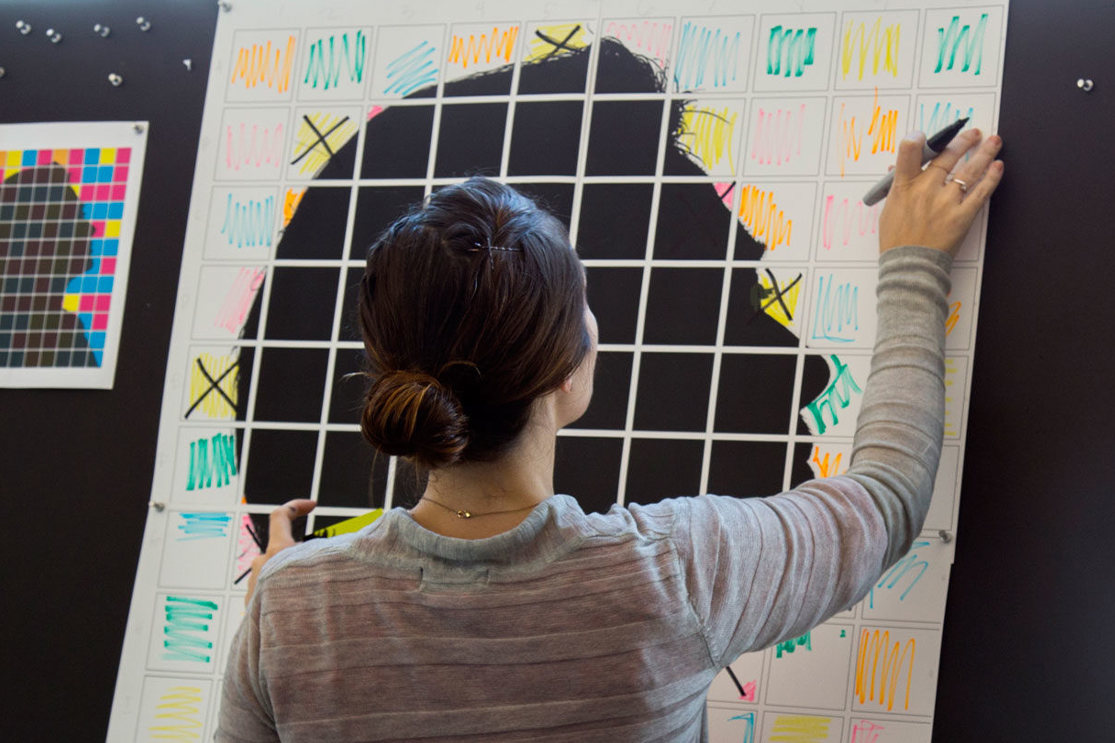
It all begins with an email from an art director detailing the subject matter, the timeline for sketches and final art, and gauging our availability. Timelines can range from a few hours to a solid week. We like to present 3–5 sketches for every article, conveying the idea and intent for the art as fast as possible. We’ve learned not to be too precious with our ideas because most of them end up in the graveyard.
Credits
[CURRENT]/[TOTAL]
BBC✕365
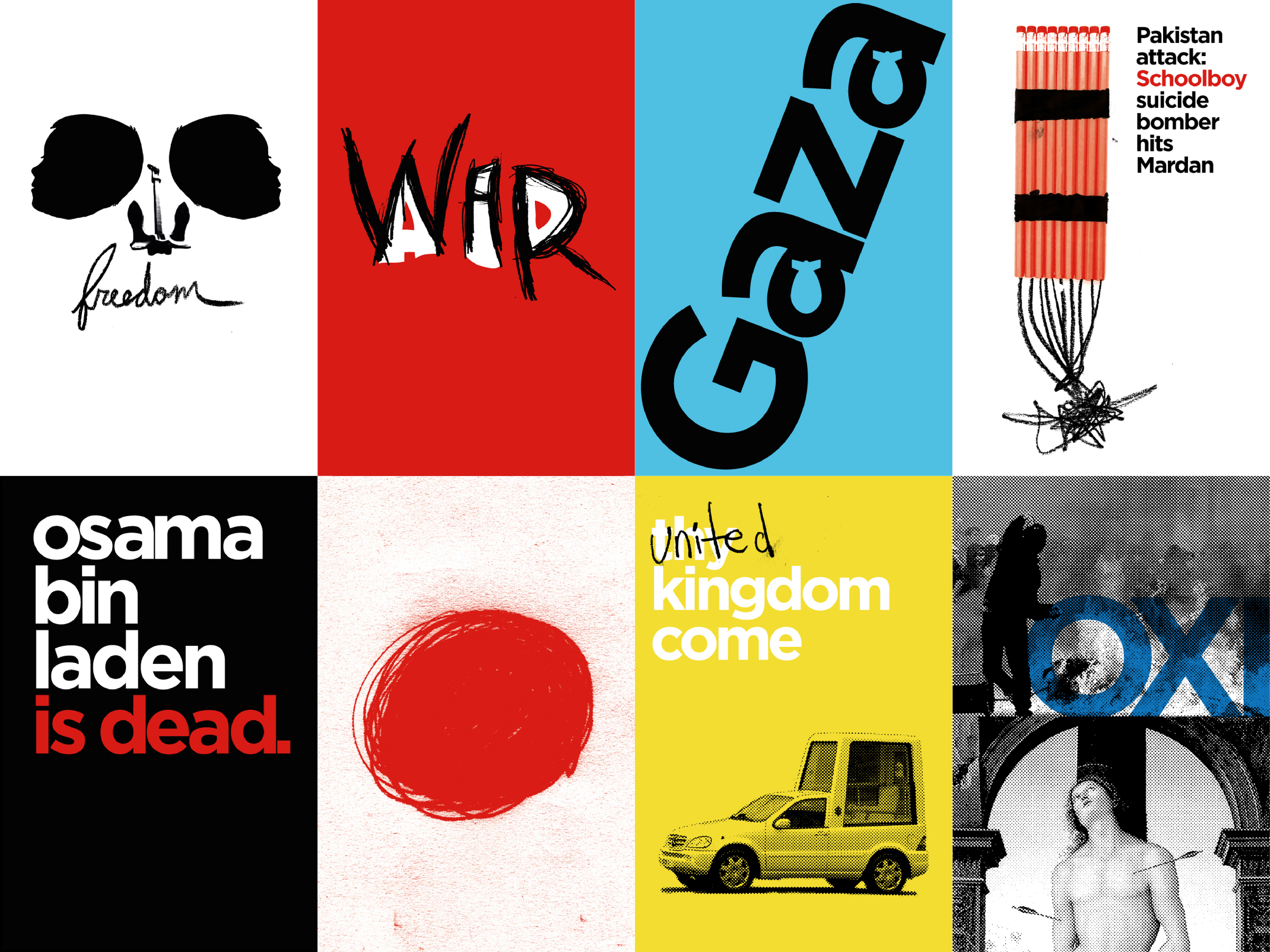
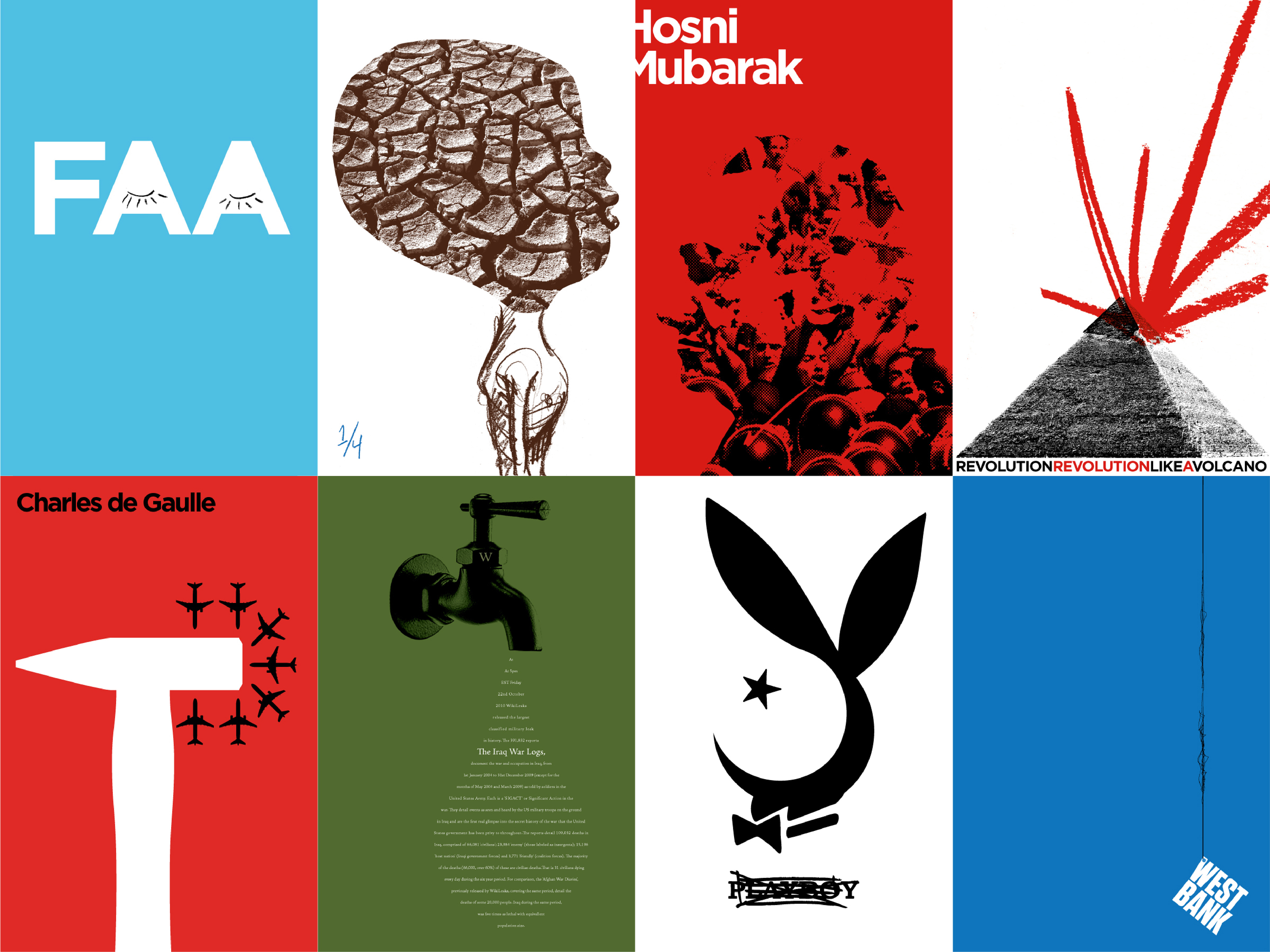
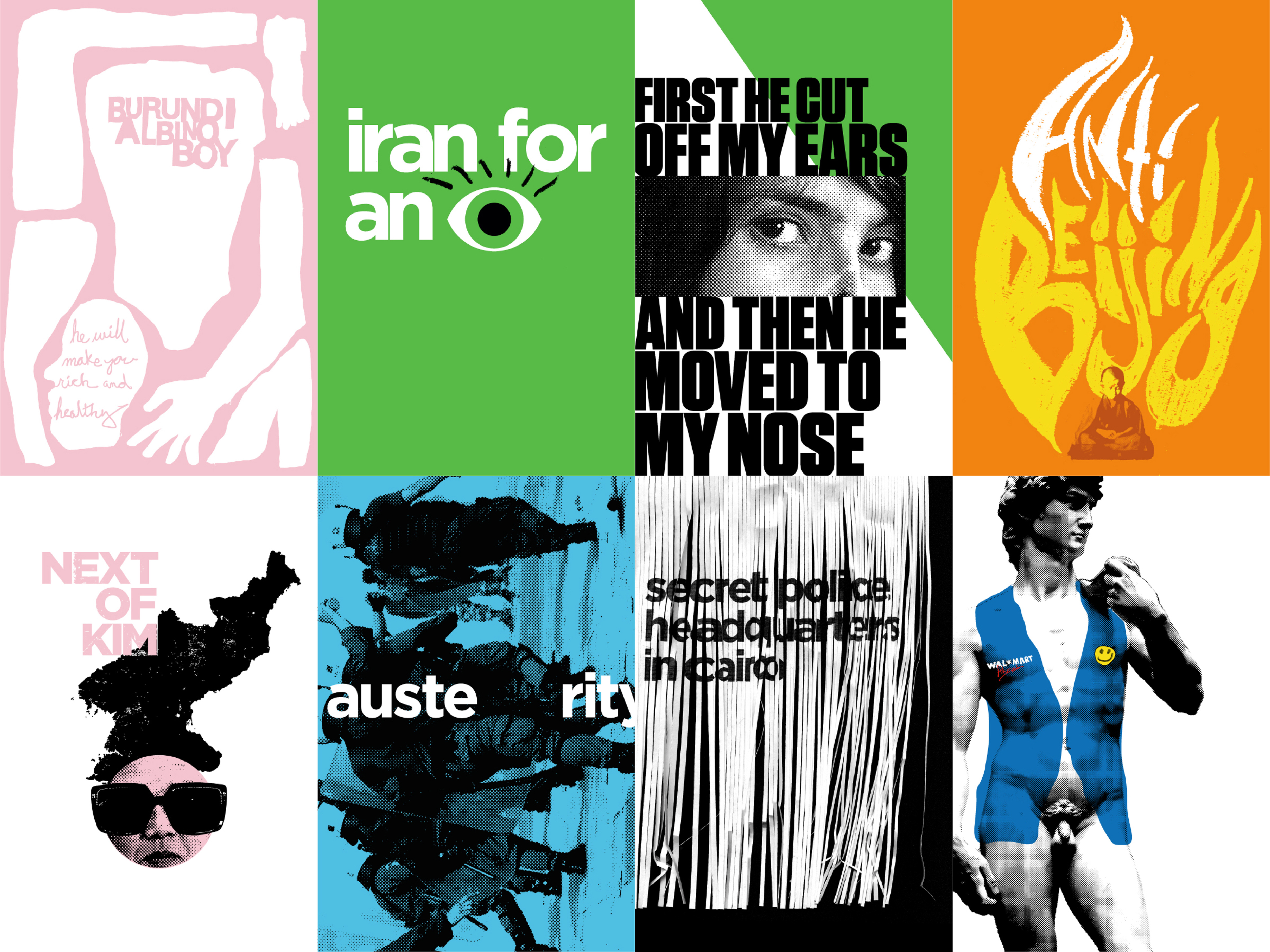
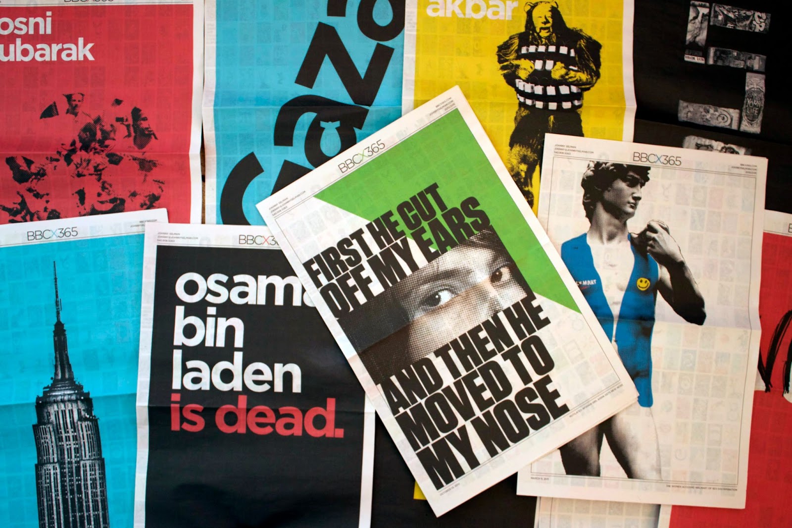
The genesis for our approach to editorial illustration stems back to 2010 when Johnny created a poster every day for the entire year based on articles on the BBC World News website. He designed and published the posters every day, without fail. Over the course of the year, the Chilean miners were lost and found, the Arab Spring caught fire, an earthquake ripped through Japan, and Obama killed Osama.
Credits
[CURRENT]/[TOTAL]
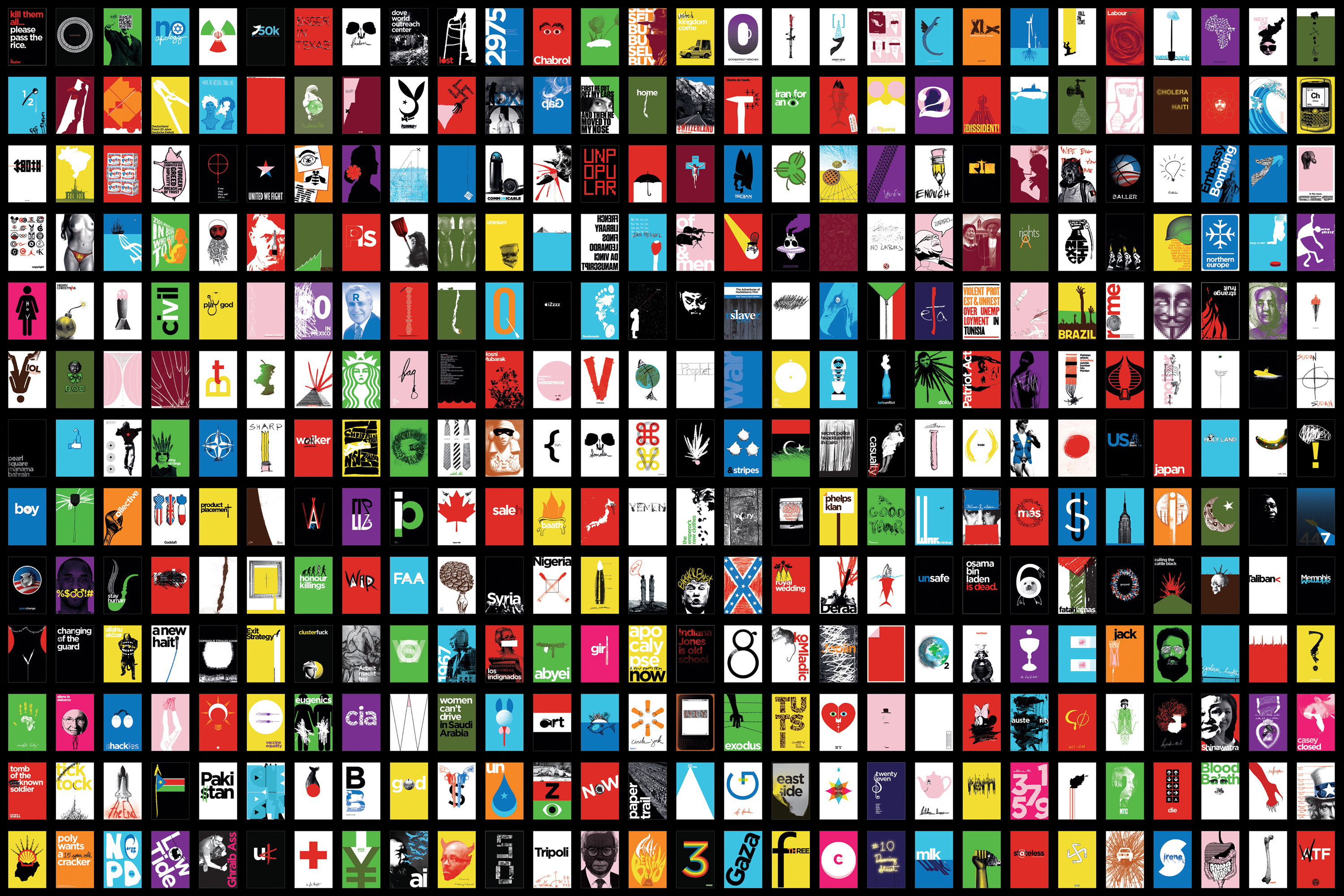
365 days and 365 posters. Every. Single. Day.
Selman Team
Albert Chang
Anne Di Lillo
Christopher Schroeder
Connor Linde
Hanjoon Kim
John Paul Chirdon
Johnny Selman
Jordan Tran
Katie King Rumford
Megan Greig
