12.04.25
Brand Architecture for Smaller Brands
Hybrid and nuance between two oft-discussed models

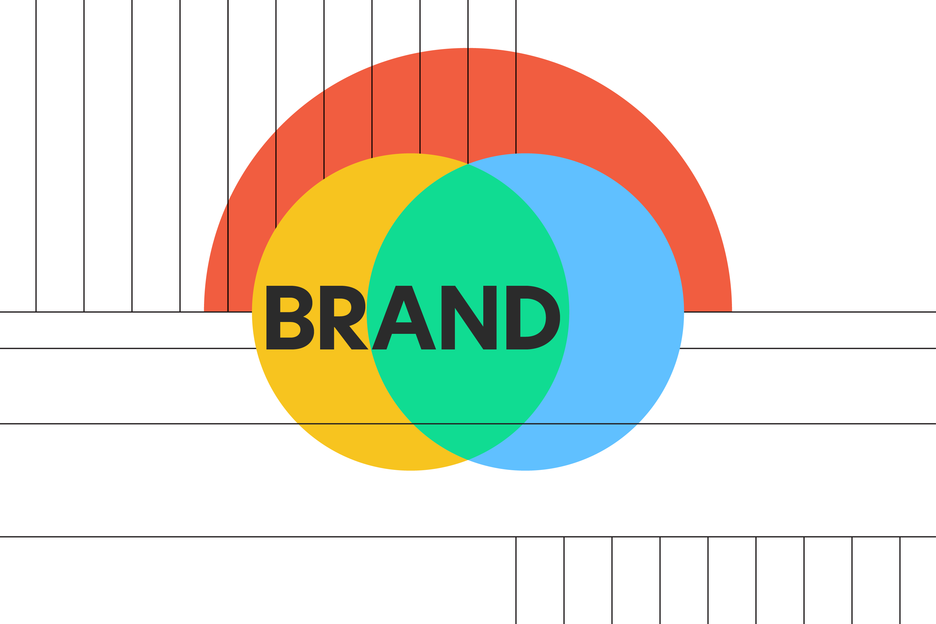
How does a brand apply itself to its products so the customer can best understand? That’s brand architecture, baby. Textbook examples feature Fortune 500 brands as a simple visual math of Logo plus Logo, or Brand plus Product, and the discussion often boils down to two high contrast approaches: Branded House versus House of Brands.
Does this offer the nuance needed for smaller brands?
Yes, the same principles are helpful even if you aren’t FedEx, Apple, or Virgin MegaBrands. Make sense for customers. The branded house/house of brands models offer a strong contrast for comparison. There is more hybrid territory between them, because there must be: the real world, where people and brands live and grow organically, is imperfect. So, go forth, experiment, be genuine, but also be easy to follow, so the brand is easy to love.
Candylab: A house, undivided
Candylab Toys, a recent client, is a humble toy brand with ambitious designs and bigger potential. They needed to evolve their brand identity, including two core product lines of travel-inspired, retro-mod wooden cars.
We had been building layer upon layer of identity, more or less organically, and it had gotten to the point where things were starting to not make sense.”
Their larger, premium display models needed naming. Candycar, a smaller, simpler line aimed at kids and play, has a catalogue of world-building accessories ready to launch. The signature aesthetic shared between the two car sizes was causing product confusion online because the physical scale and production difference weren’t obvious to customers.
This project began inside this architectural nuance, and we found ourselves spitballing against these canonical models. We have experience with two particular Fortune 500s and looked there for comparison.
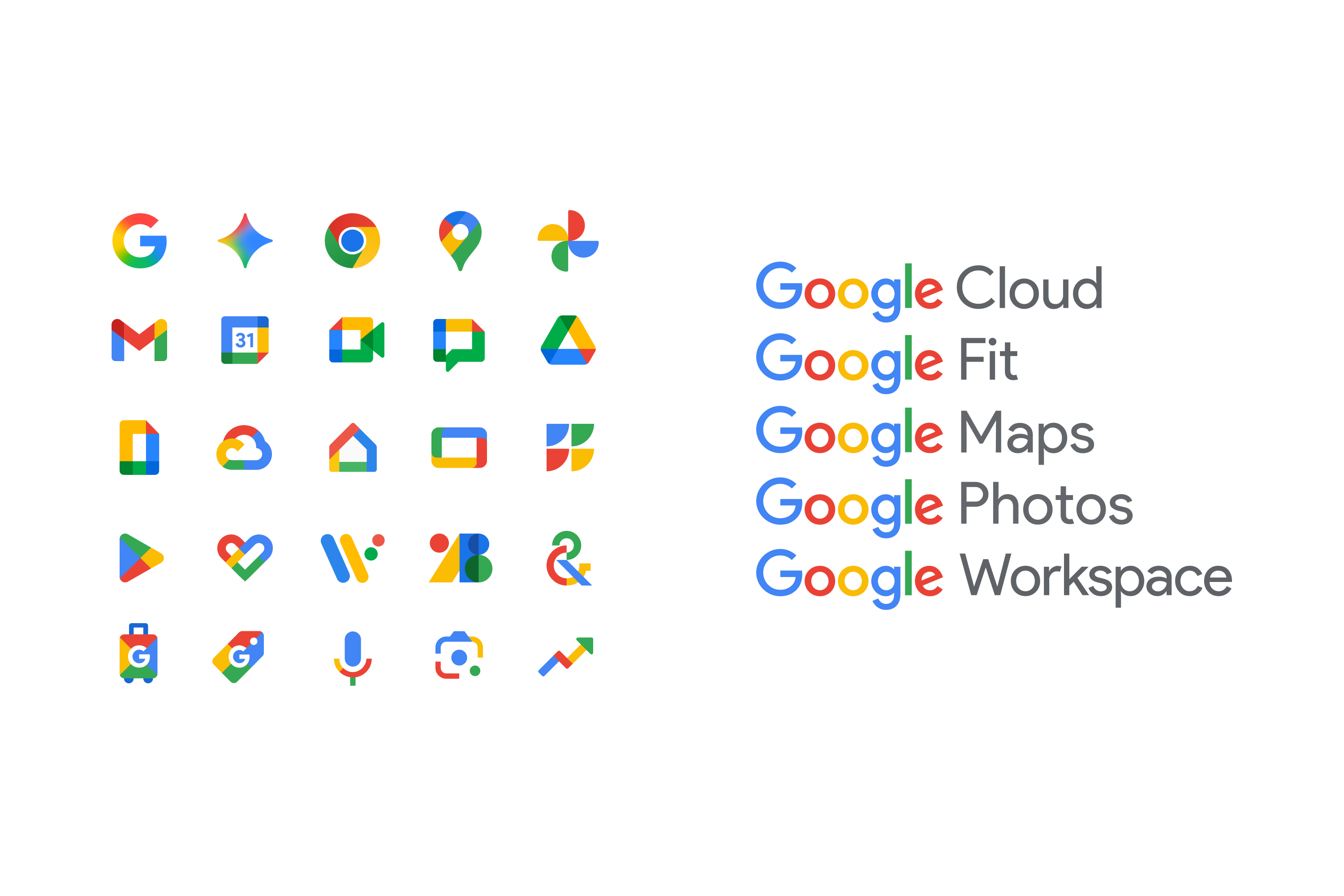
Google: Our Branded House client
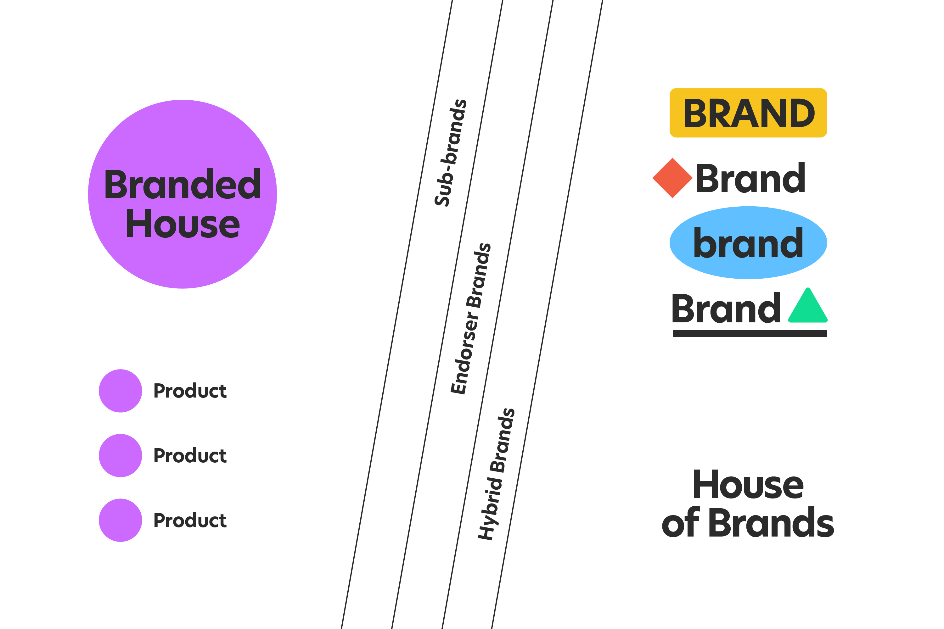
A branded house (also called a “monolithic brand”) reinforces familiarity, efficiency, and one trusted brand for the customer. Its products serve dutifully as proof of purpose. We’ve worked with many teams at Google over the last twelve years. Their mission (making the world’s information accessible and useful), tone (helpfulness), internal knowledge, and resources are core to the brand’s strength. A branded house (also called a “monolithic brand”) reinforces familiarity, efficiency, and a trusted brand for the customer.
Kenvue: Our House of Brands client
A house of brands brings organizational knowledge, guidance, and resources from the parent brand to its portfolio. Still, it accommodates a broader span of products/purposes with sub-brands, tailored marketing, teams, styles, visual identities, and channels. We helped launch the Kenvue brand with a print, digital, and motion campaign for IPO listing day. It’s an iconic brand portfolio with different audiences within distinct categories: self care, skin care & beauty, and essential health.

These examples serve their architecture dutifully, but corporate restructuring did help. Kenvue was created in 2023 to separate J&J’s portfolio of products. Google created Alphabet, its own holding company, in 2016. But YouTube, a mega brand in its own right, sits uniquely outside of that 4-color product icon scheme and brand typeface, though its creative oversight is very tied into the whole branded house. (Dun Dun Dun. Plot thickens.) Even a world-class branded house still delves into hybrid architecture. Extenuating circumstances, all that.
Smaller brands like Candylab may have smaller portfolios to sort, but business constraints of their own, humbler resources, and personal attachments to existing design DNA as they embark on the quest to evolve.
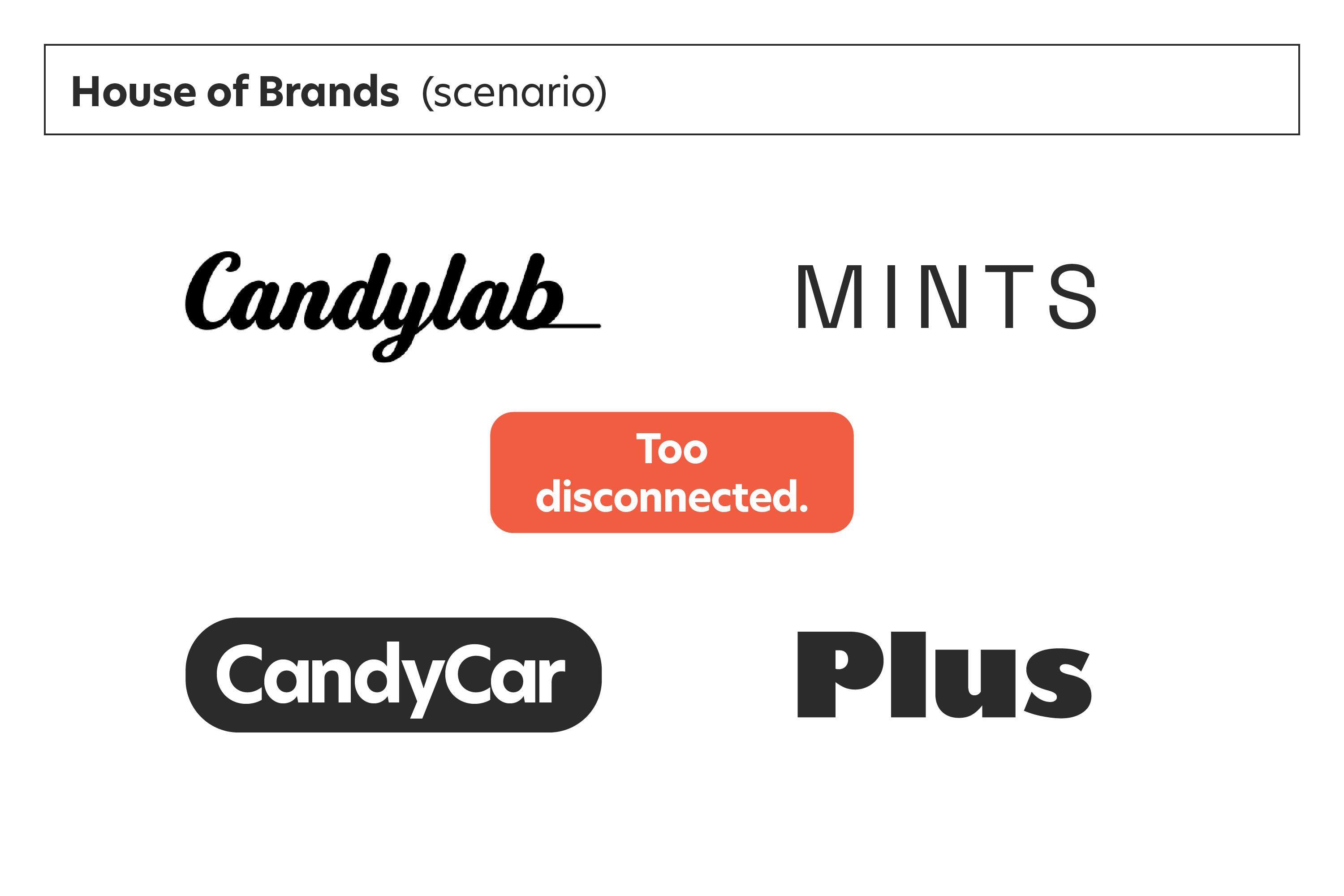
A house of brands approach wouldn’t be genuine to the shared values, culture, and aesthetic behind these two lines and additional products in development. It had already proven inefficient for the company’s scale and creative demands.
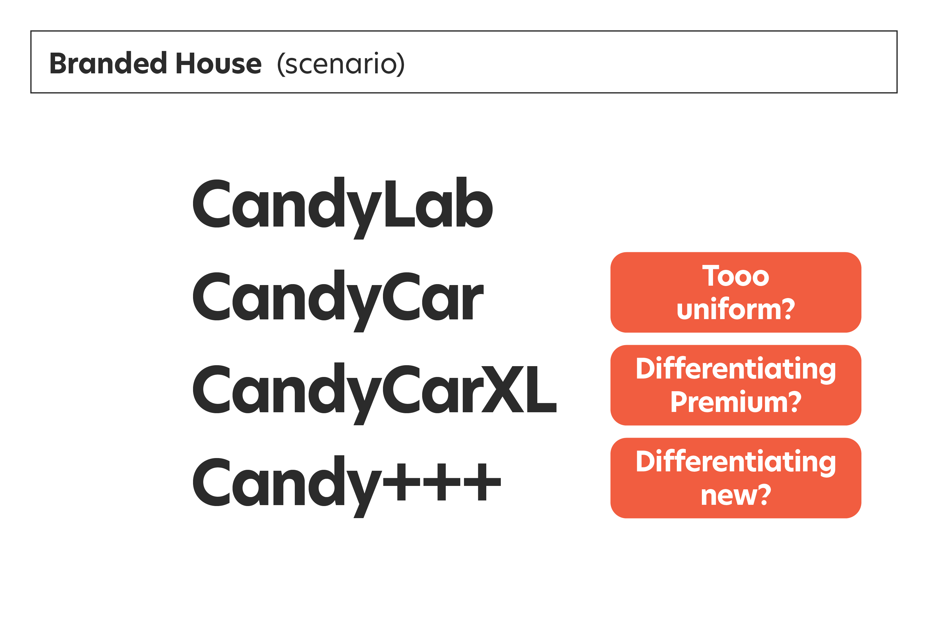
Conversely, a branded house model wouldn’t work cleanly with naming and trademark constraints in play. It’s not a solution aimed at visual nuance. We, too, needed to consider hybrid approaches to architecture to help Candylab go its own way. The architecture and visual identity evolution needed to build better recognition for Candylab, while also distinguishing the positioning of the two product lines.
Fun Follows Function
One functional family DNA threads a clear resemblance between the brand and products. The typical fluidity afforded to most modern brands gives us subtle levers to blend and mix those traits uniquely between products to help customers intuit.
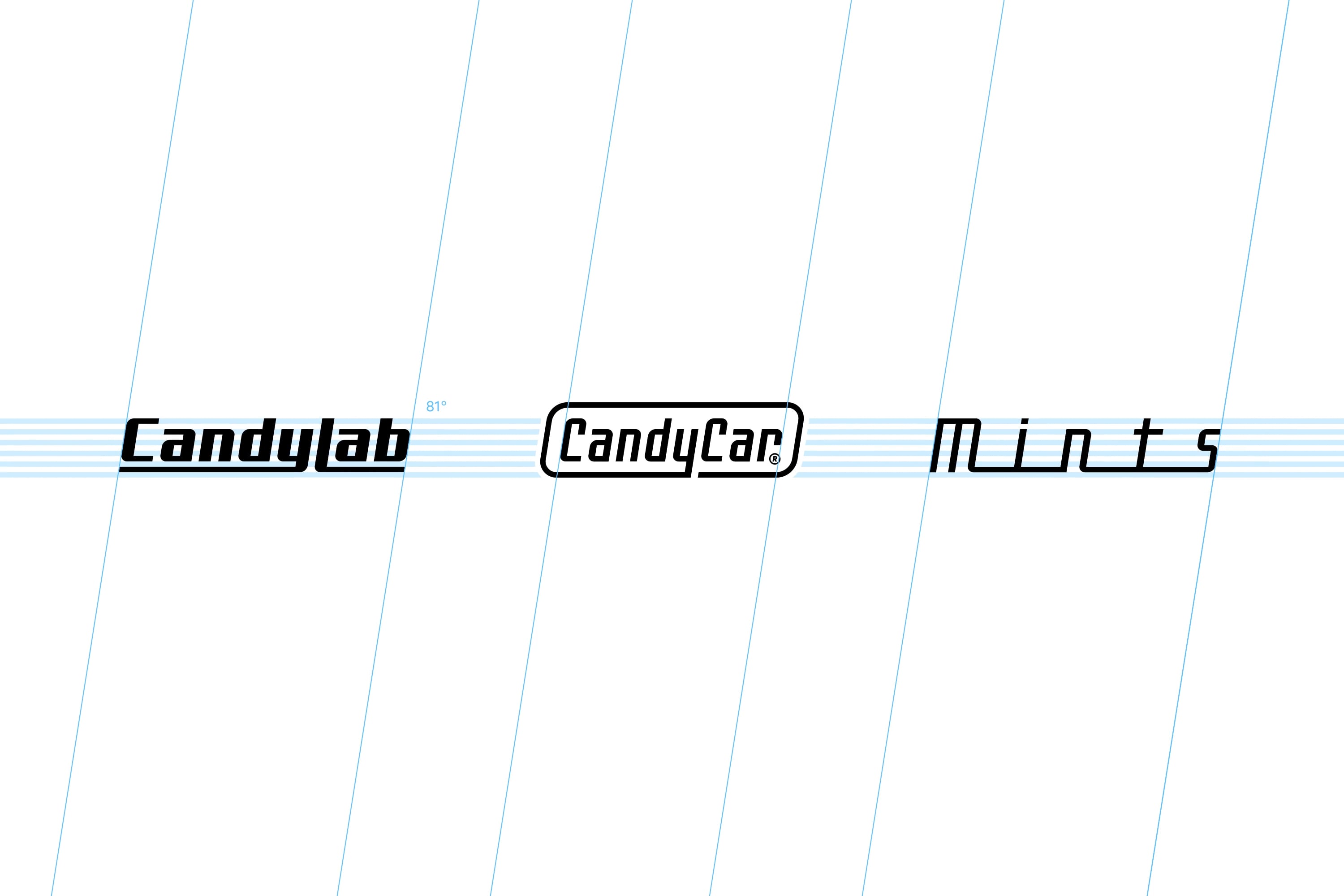
Naming & Logos
Related naming with shared style, proportion, construction, geometry. Candylab is bolder as the parent, while each has a distinct treatment.
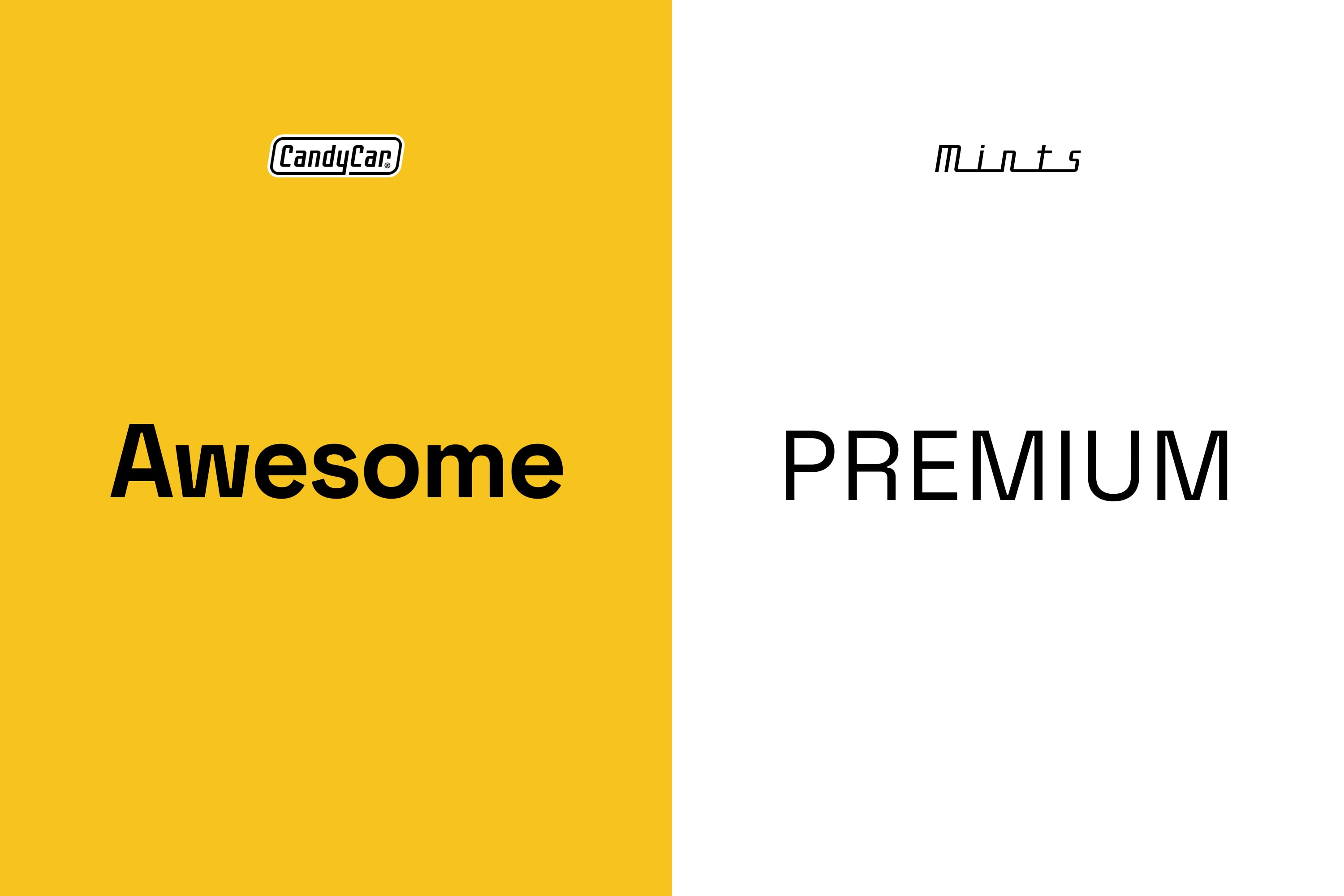
Product Positioning
Similar but different. Of the Awesome and Premium varieties.
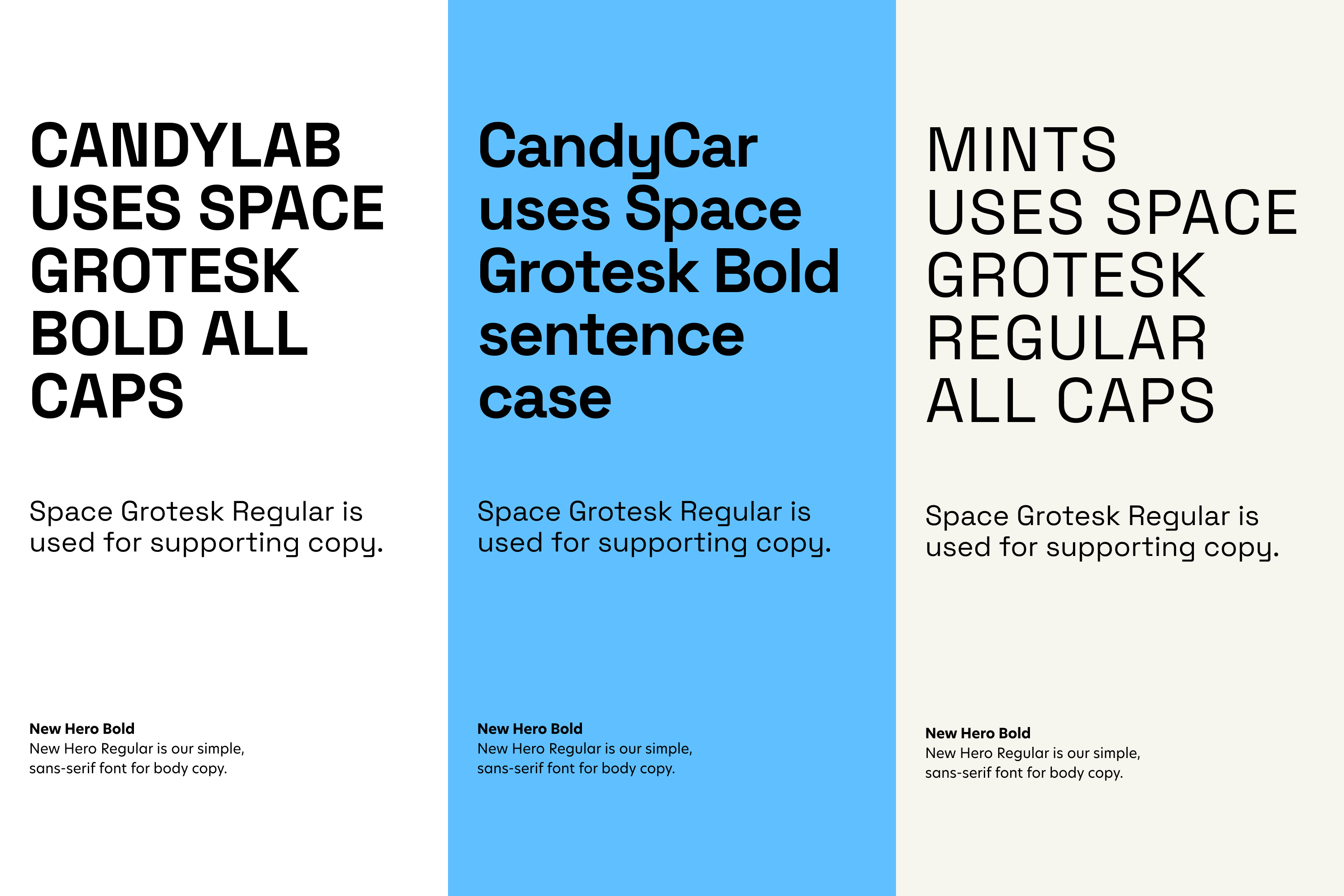
Typopgraphy
Shared type family with unique, playful geometry and form. Varied type styles between product lines are recognizably connected but instantly differentiated.
Color
One brand palette. Candylab uses cascades of color blocking or banding and white space together. Candycar uses bold, immersive color backgrounds for awesome energy. Mints uses light, white backgrounds for a premium feel.
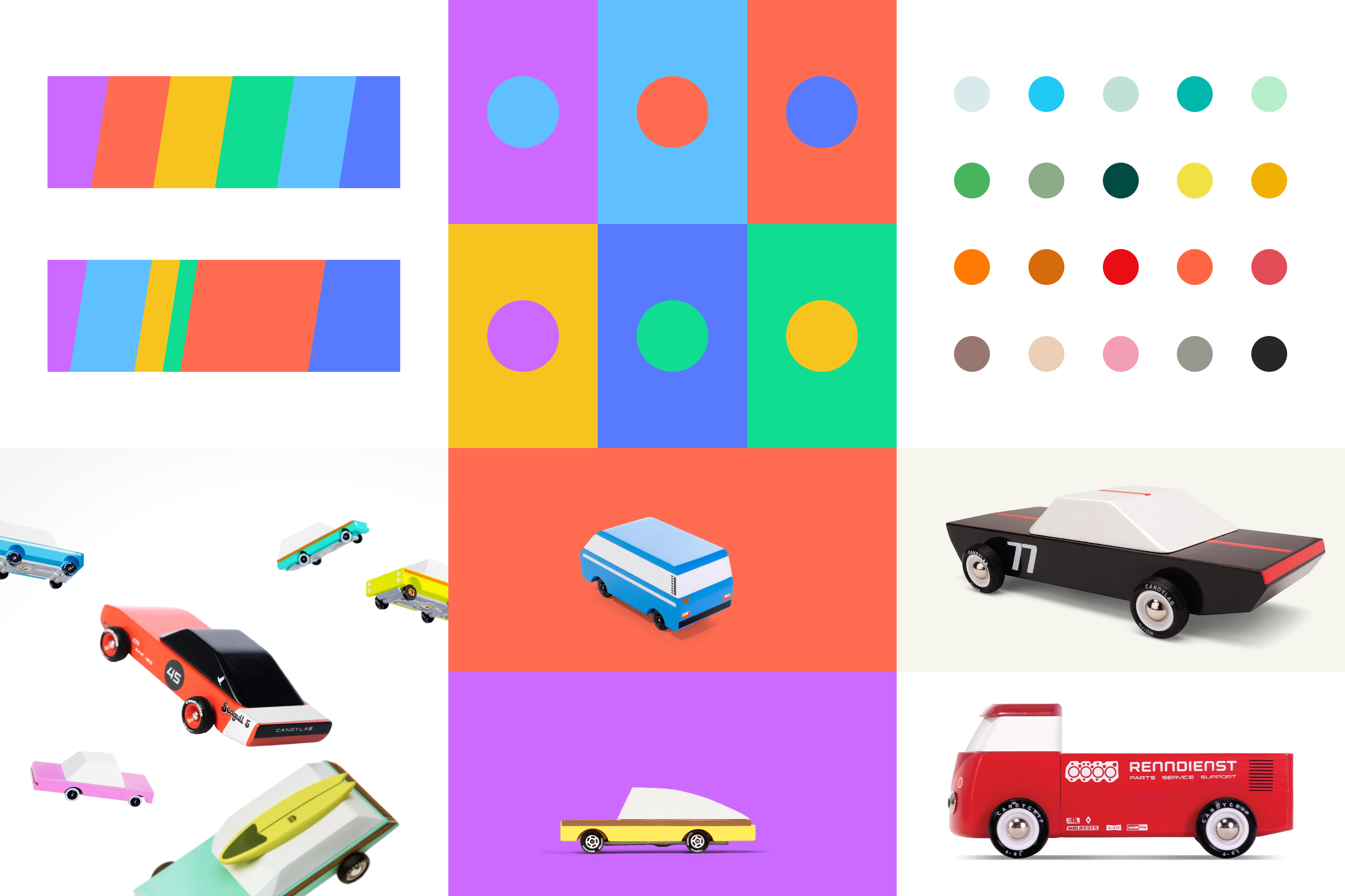
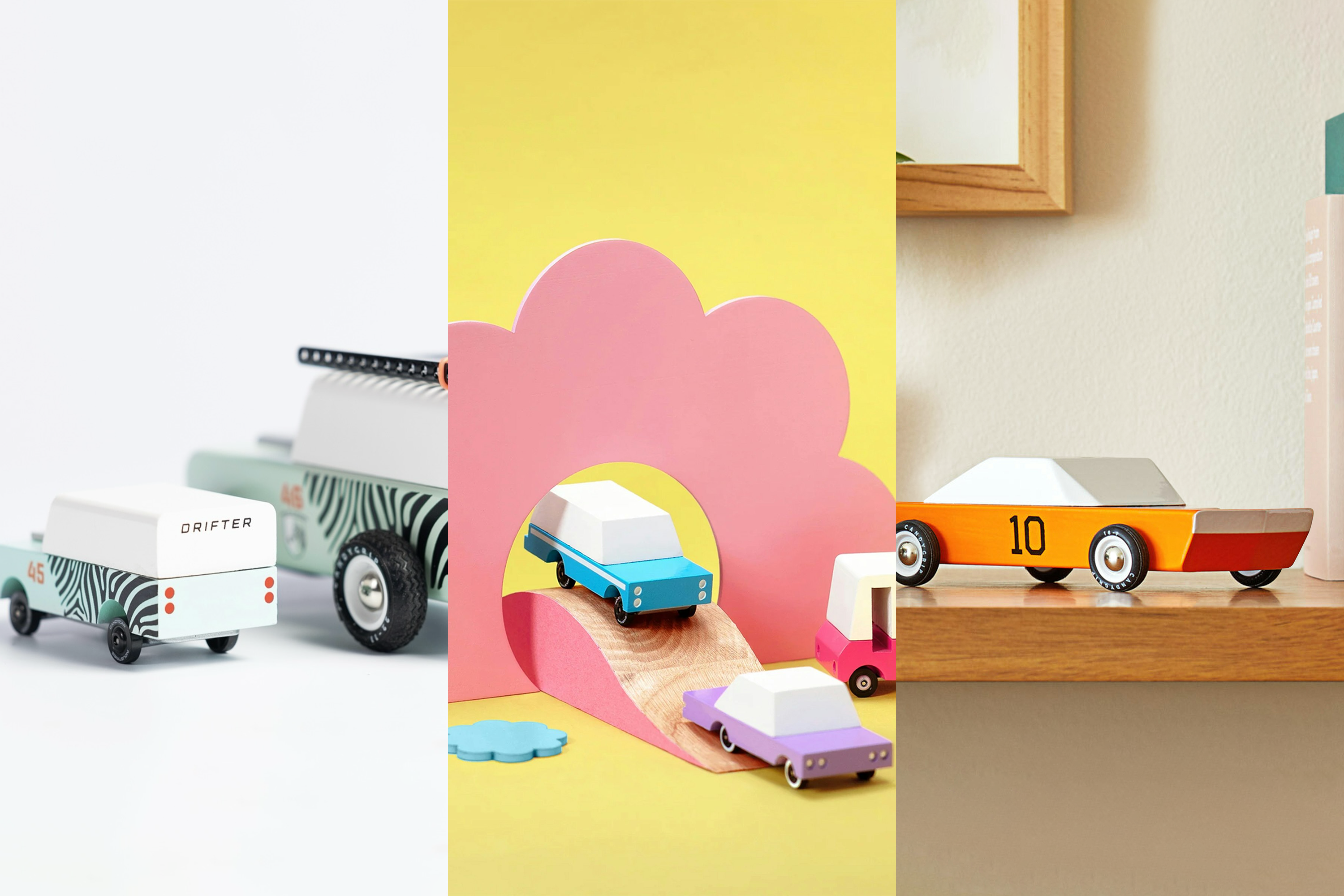
Photography
Candylab can show both product lines in a helpful comparison. CandyCar portrays a child-like world, connected by roads, accessories, and imagination. Mints are focused, still-life, vignettes of escape inside a real-life context.
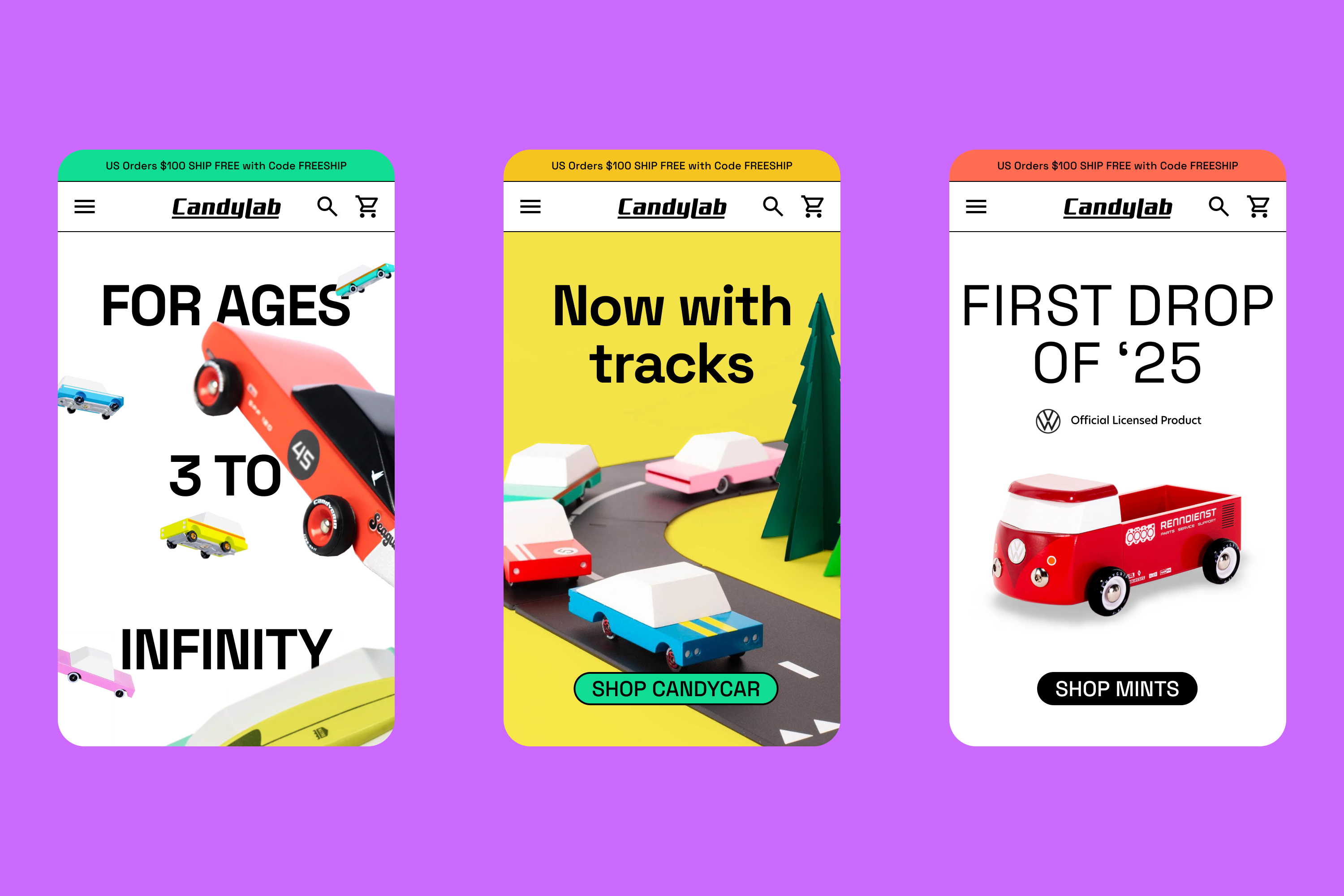
UX
Candylab leads the show. Home page modules and parallel structure within the site nav delineate the two product lines. The logos are engineered to work at a small scale within the navigation to familiarize any newcomers.

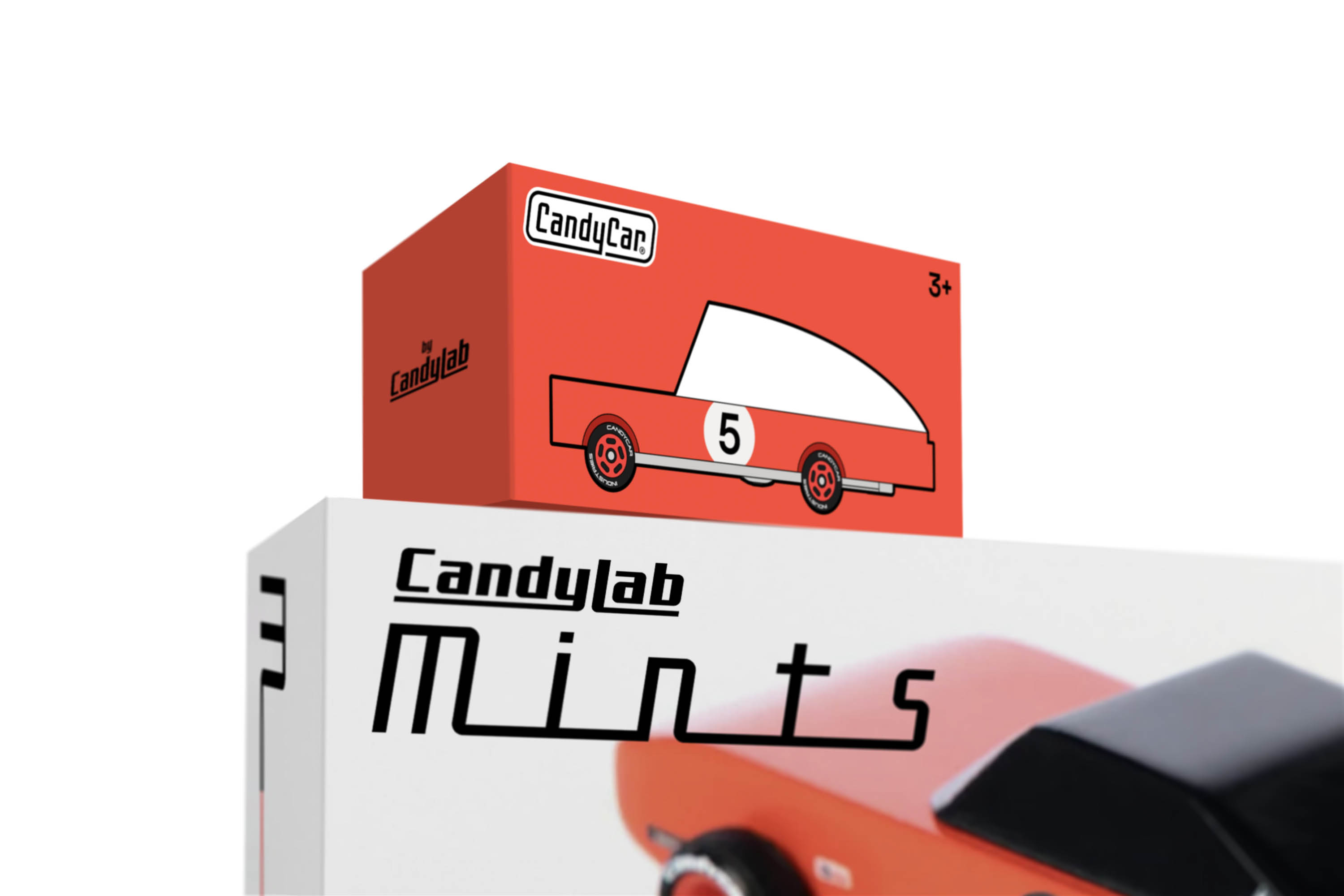
Packaging
Shared structure and hierarchy. With distinct art direction, seen as type, Color, logos, and architecture come together. Illustration vs photography further distinguishes the awesome vs premium positioning.
Making sense
As with most things in design and life, we needed to find our own way. Models are suggestions and common wisdom. We didn’t invent a new category here. We had to validate why a hybrid approach made sense for us, and then translate what that meant for design. Context and functionality lead us there. The fun followed.
See the full Candylab case study