05.20.25
Talking Typography: A Conversation with Frere-Jones Type
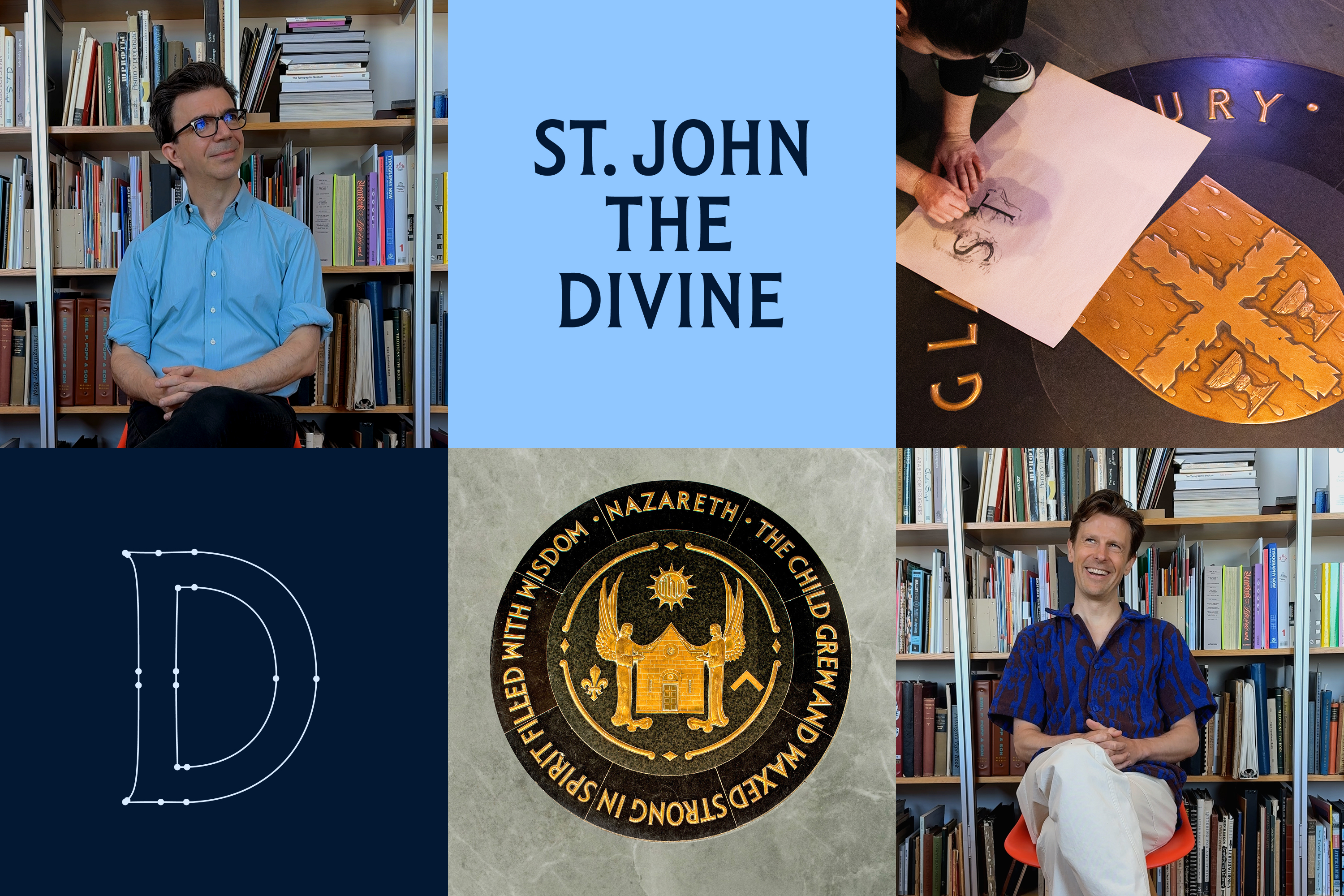
We met Tobias and Fred on a sunny Wednesday afternoon in Gowanus, Brooklyn, to chat about our recent collaboration on the new wordmark for St. John the Divine (and check out their enormous type archive).
BROOKLYN, NY | April 30, 2025
Thank you again for taking the time to do this! So New York City seems to be a focus for your foundry, on a lot of work, a throughline on lots of projects, whether it’s partnering with local design studios or cultural institutions. What’s driving that focus on NYC?
Tobias Frere-Jones, Founder, Frere-Jones Type:
It’s something that made sense for our design practice because there are so many graphic design studios here, and so many clients. But it’s also something that’s important to me personally, having grown up here in the city. I’m a native New Yorker. So it’s satisfying, getting to have some effect on the city that is my home.
Were you familiar with St. John the Divine before this project?
Tobias:
Oh yeah, I’ve been there a couple of times, but you know, I spend all of my time here in Brooklyn. The other end of Manhattan was not a place I would go to so frequently. But of course, we all know what St John the Divine is.
Fred Shallcrass, Type Designer, Frere-Jones Type:
I’ve ridden past the church a couple times, but never been inside. So it was cool to see all the lettering that they have inside and be able to work with some of the photographs and rubbings that you guys took.
What drew you to work on this particular project with Selman and St. John the Divine?
Tobias:
It has that really deep connection to the city. I’m personally most interested in the things that are least similar to anything else that we’ve done. It looked like a new kind of challenge, a new kind of client we hadn’t had before. And I don’t think we had worked with this particular kind of historical artifact as a source before–the sort of rounded front-dimensional lettering. Just all by itself, that abstract point felt fun.
Fred:
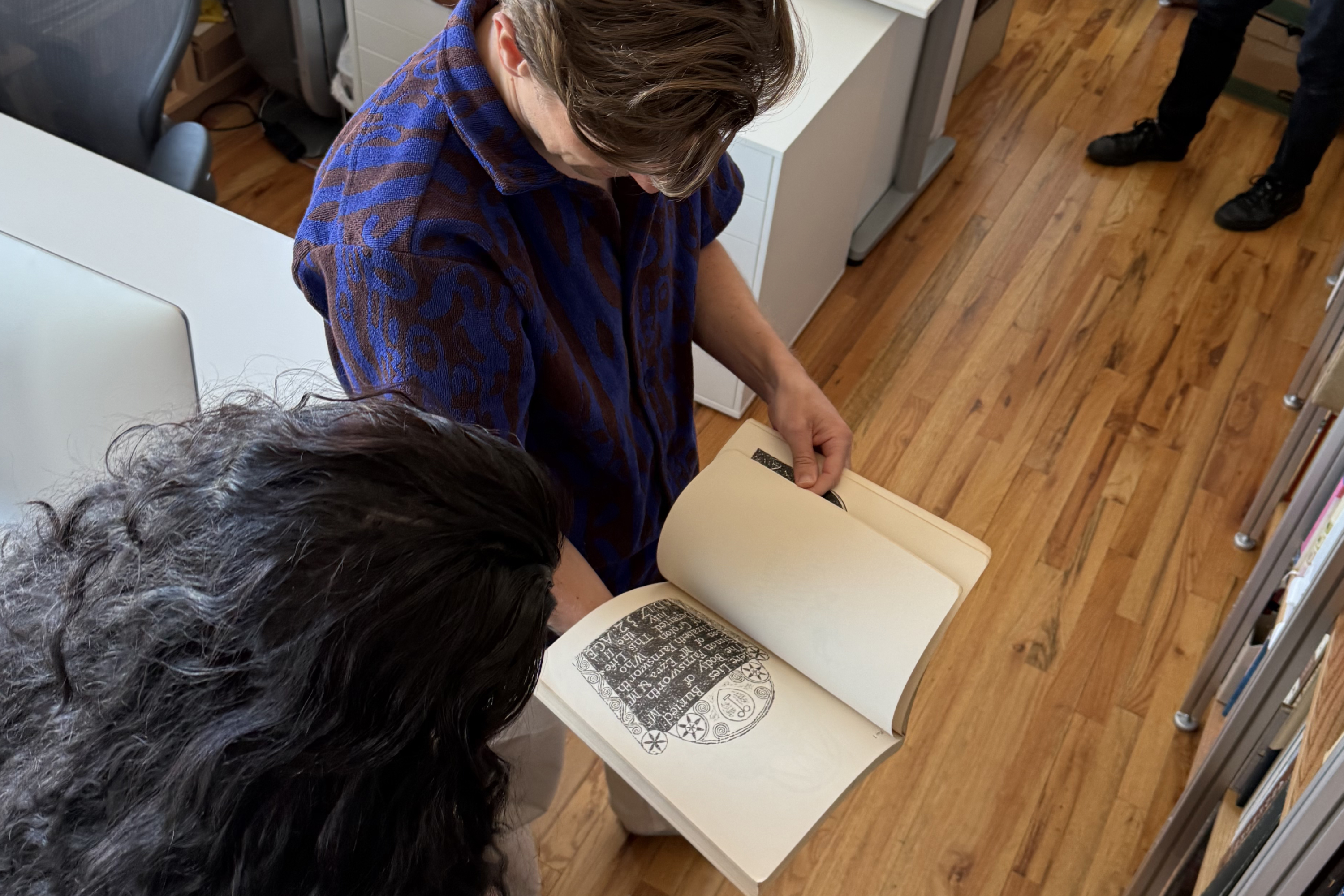
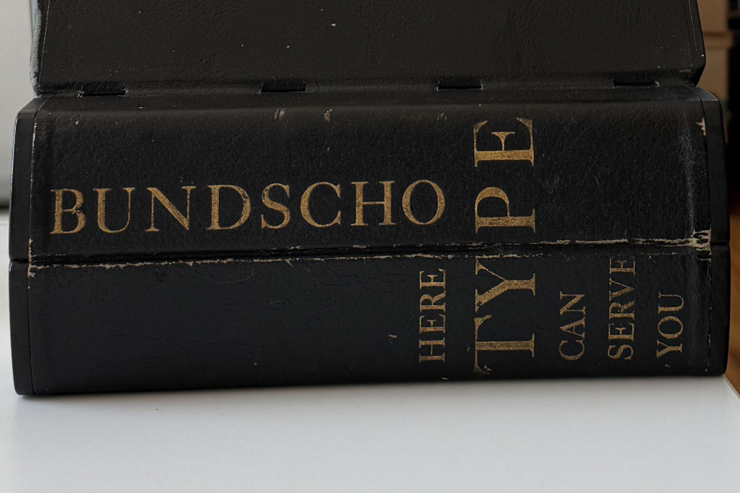
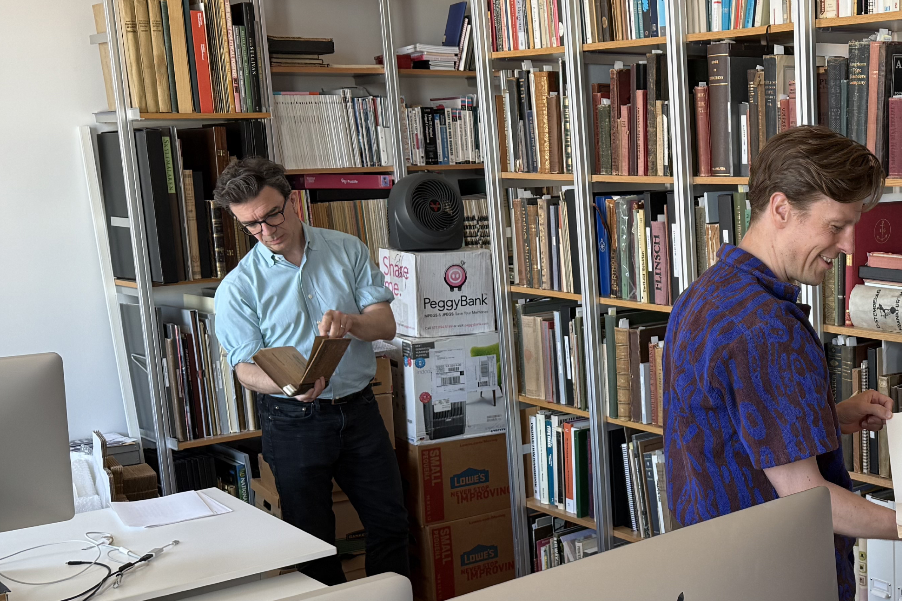
Obviously, with a library like this–(Fred points to Frere-Jones’ packed shelving system filled with historical reference and type collections that we would happily spend days looking through)—there’s basically some kind of reference to every kind of letterform. We were just looking through the books here to try and find examples of similar cast bronze letterforms, and we didn’t have any kind of exact matches here. The forms seem somewhat familiar to me, but Tobias feels like he hasn’t seen anything exactly like it in his travels.
We were talking before that everything has a historical context, especially this sort of bronze cast lettering. Are there any sort of tips or tricks or ways to frame your thinking when translating something in real life into 2D?
Fred:
I guess one of the hard things when you’re working with historical material is trying to balance not just the physical nature of what you’re working with, but also the impression that they were trying to give. You’re always thinking about how to convey the kind of the spirit of the letter as it was made, not just the literal outlines of what is there.
Tobias:
The key is to keep in mind that we are making a translation, that it’s not just throwing a butterfly net around this artifact that you’ve been given, turning it into vectors, and you’re done. That may have a sort of unexpected result, not having the kind of atmosphere or the sort of flavor that you think it will. For the same reason, if you take a picture of some architectural vista, it won’t capture that much of what it actually feels like to stand in that ancient square, in that amphitheater or whatever. Because what you’re remembering is the actual thing plus all of your associations that go with it, and the camera is only going to catch one of those. It’s not going to catch all the others.
So our job is to make a translation, either by adding something or emphasizing something, or transforming some aspect, that can capture those parts that the camera misses. It’s almost like a sort of impressionistic kind of approach.
Fred:
One of the things which happens when you’re working with this kind of historical material and type is that the digital environment you’re working with is a lot less forgiving than a physical environment. There’s nowhere to hide in the pixels. Pixels are either on or they’re off. With a physical material, you can have a kind of softness to the edge quality. And so one of the things that’s quite challenging when you’re working with historical material is trying to bring in some of that softness and warmth into the letters.
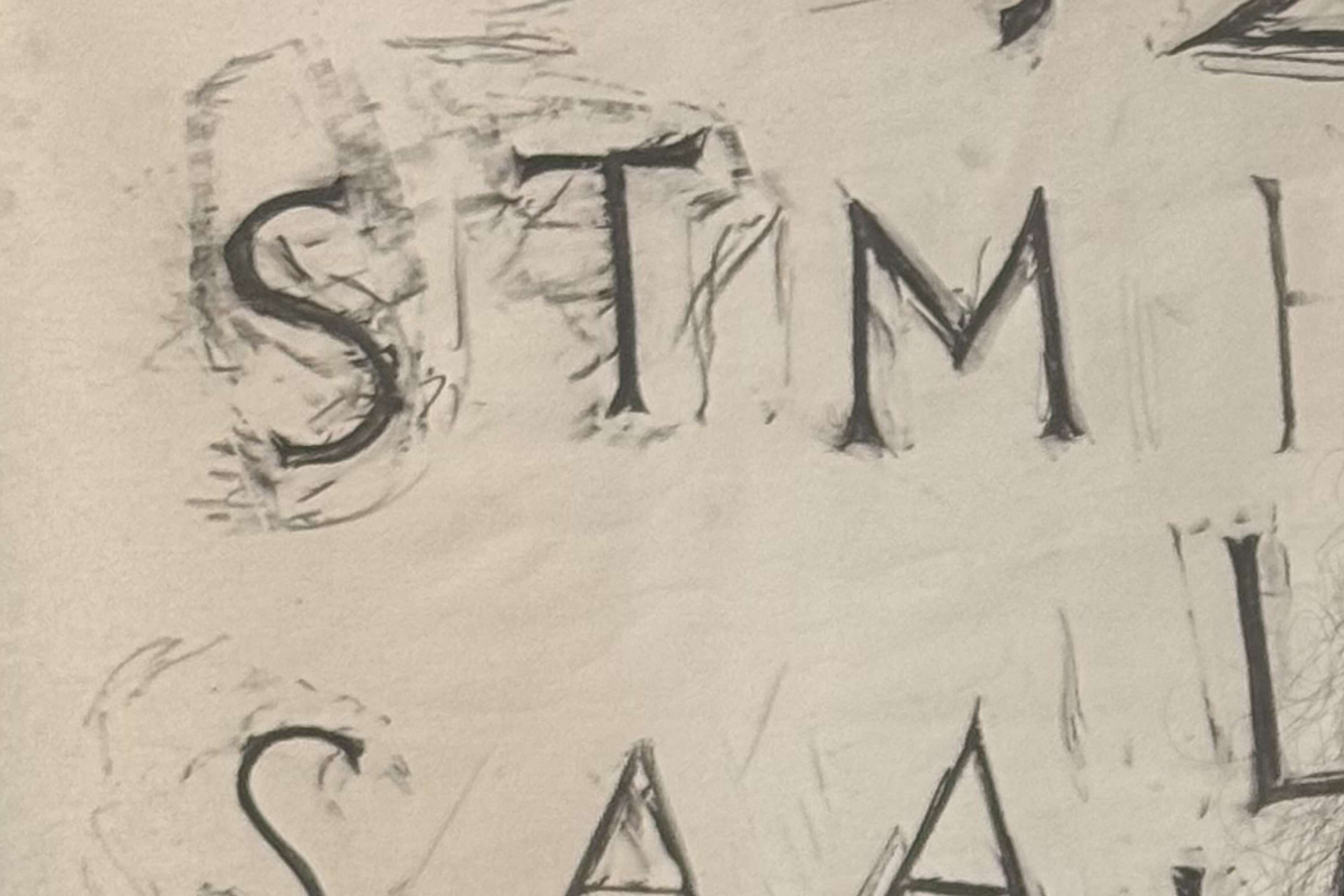
When we were working with the photographs and the rubbings, which Selman provided us with, we noticed that the way the light reflected off the cast letterforms created a different effect than what the actual outlines themselves did. So what we tried to do was exaggerate the digital shapes so that they gave off the same kind of visual effect as the cast letterforms do in three dimensions.
One of the things which happens when you’re working with this kind of historical material and type is that the digital environment you’re working with is a lot less forgiving than a physical environment. There’s nowhere to hide in the pixels.”
Could you give an example of working with those details? In the first round, you sent over that line on the letterforms where the light reflected. That was like an “aha!” moment to us.
Tobias:
This is a great example of where to get from a three dimensional object to a two dimensional shape, we need to do something extra in there to be able to catch this.
Seeing the rubbings that people would make, those letterforms didn’t actually look much like the letters you would see on the floor. The rubbings would come out much lighter and much more organic than you would expect, which is due to the rounded profile of that shape. It’s not nearly as straightforward as it looks.
Fred:
One of the quirkier aspects of the shapes of the letterforms we were working with was the horizontal proportions of the letterforms. There were quite narrow glyphs, like a capital H, and then quite wide glyphs, like a capital O. I think that part of that may have been to help with dealing with the curve which these letterforms were set on originally. So, a very wide H is going to look slightly out of balance, in comparison to a similarly proportioned capital O, and so these kinds of condensed proportions were likely efforts to help them fit around this curve. We really worked on massaging these widths in a way that they would really gel in a simplified wordmark.
It’s hard to know whether or not this (type) was something that was broadly available as a set of casts or whether they were custom-made for the cathedral. We’re not entirely sure about the origin of the letterforms themselves. Did you guys find out anything about the letters?

The only thing we found was that they were made somewhere in Flatbush, Brooklyn. It was a shop called Brooklyn Ironworks, and there’s a hospital now at the address where the factory was listed. We’re still looking for a receipt or something in the Church archives. It’s pretty mysterious, actually; it kind of disappeared from record.
Fred:
Yeah, cool! We were trying to look for something kind of similar in the books. And oftentimes, the examples that we found in the books were serif forms, but they were kind of quite exaggerated in their serifs. This kind of almost hybrid sans and serif combo that we’re working with is not something that you really come across every day.
How was your experience working with our team on this project?
Fred:
Working with Selman was really great. You came to us having done a lot of research before even arriving at the point of contacting us. There were rubbings, there were photographs, and this kind of research and engagement with the client meant that by the time that we were involved, it was a very smooth experience. We could really focus on the letterforms and making sure that all of this research was leveraged in a useful way. And I think the result was really positive. So, it was a great experience.
Tobias:
I mentioned clients as being on a certain spectrum. At one end, being sort of vague about what they want and sort of indifferent about what the result is, and at the other end, micromanaging every moment of this. And there’s this really narrow band in the middle, where the client knows what they want, but they also trust us enough to do what we were hired to do, and Selman is there. So that made this a really positive experience.
St. John the Divine is purely a wordmark, there’s no symbol or shorthand. The system is primarily based on a combination of typefaces. What’s your perspective on the role of type and type choices in shaping culture and communication today?
Fred:
One of the things that you (Tobias) said that always stuck with me was: the amount of time between when you wake up and when you interact with some letter or figure that somebody drew, is seconds, and then all day long, you’re interacting with letters and figures that people drew until almost the moment that you go to sleep. Most people would never think about this, right? They never think that somebody decided what all these letters look like, all these things look like. But it’s right. All day long, it’s impacting the way that you interface with the world.
Tobias:
I think type is like the water that we’re swimming in all day. Whether it’s some piece of news or entertainment or just, you know, an email or looking at a weather report or whatever. These decisions about letterforms are going to be in there, and I think type is so powerful because it’s so small. Because we hardly ever see one letterform at a time, it always comes with friends, lots of friends. The way that these shapes interact with each other, the way they cooperate with or push against our experiences as readers, those all add up to this subtle but completely inescapable result. If you think of any historical period—the 80s, the 60s, the 20s—you might think of some specific example, some movie, some person, some event. But I find the most powerful associations are the broadest ones, whether it’s a certain color palette or a certain vocabulary of shapes and tempos, and so on. And that’s type and design leaving its mark on how this moment in time gets recorded.
I think type is like the water that we’re swimming in all day. Whether it’s some piece of news or entertainment or just, you know, an email or looking at a weather report or whatever. These decisions about letterforms are going to be in there, and I think type is so powerful because it’s so small.”
This interview has been edited for length and clarity.
Credits
[CURRENT]/[TOTAL]
