01.23.24
Type of Amateur: Professional Learning
As a professional and parent, what about finding energy for new skills?
I’m pulled towards type. Many graphic designers are. Work in communication design, branding, or advertising, and ignore its nuances at your own peril. It’s powerful, the straight dope, the visual voice of a brand or communication.
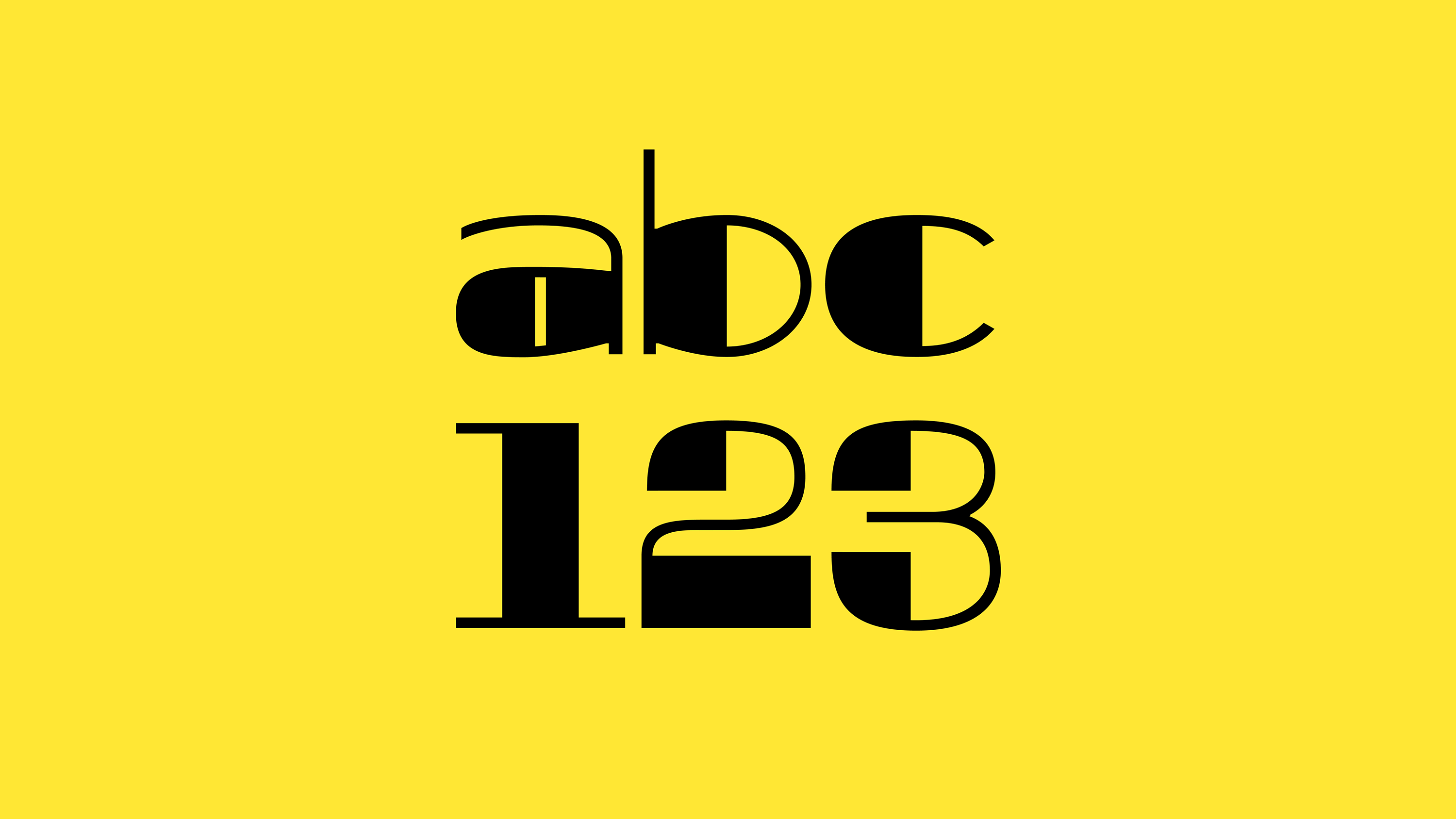
As a Creative Director, I generally dabble in many tasks and roles. But I’ve worked long enough to recognize my specialties, or at the very least, my sensibilities. They revolve around words: framing, storytelling, copy, and thus, type and typography. After two decades in design, I write more than ever as part of my job or process: planning, communicating, presenting, and as tangible deliverables like positioning or copywriting. But I'm still drawing logos, logotypes, and custom type—trying to weave specific visual details or metaphors into letterforms, words, or brand names. I’m a professional, but in this specialized regard, I’m an amateur. Typography, ok. But type design? That sounds like extremely specialist territory… because it is.
There’s an ocean of craftful consideration between basic, singular shapes and unified, effortless typefaces. And to this end, display type is a compelling way in for the novice type-tinkerer.
[A display typeface] is intended for use in display copy at large sizes for titles, headings, pull quotes, and other eye-catching elements, rather than for extended passages of body text.”
There it is. The forgiveness of scale. The reduced needs of limited use. I discovered Principles of Typeface Design: Display Type, a class in the Type@Cooper program at New York’s Cooper Union taught by instructor Zrinka Buljubašić. Time requirements were a three-hour lecture/discussion plus a full day of creative development each week for twelve weeks. Yikes. But after five years of parenting and a pandemic, it seemed like a good time to shake things up, sleep or failure be damned. I’d like to share some simple rediscoveries through the process that I think serve as a reminder or endorsement of learning itself.
Set your goals
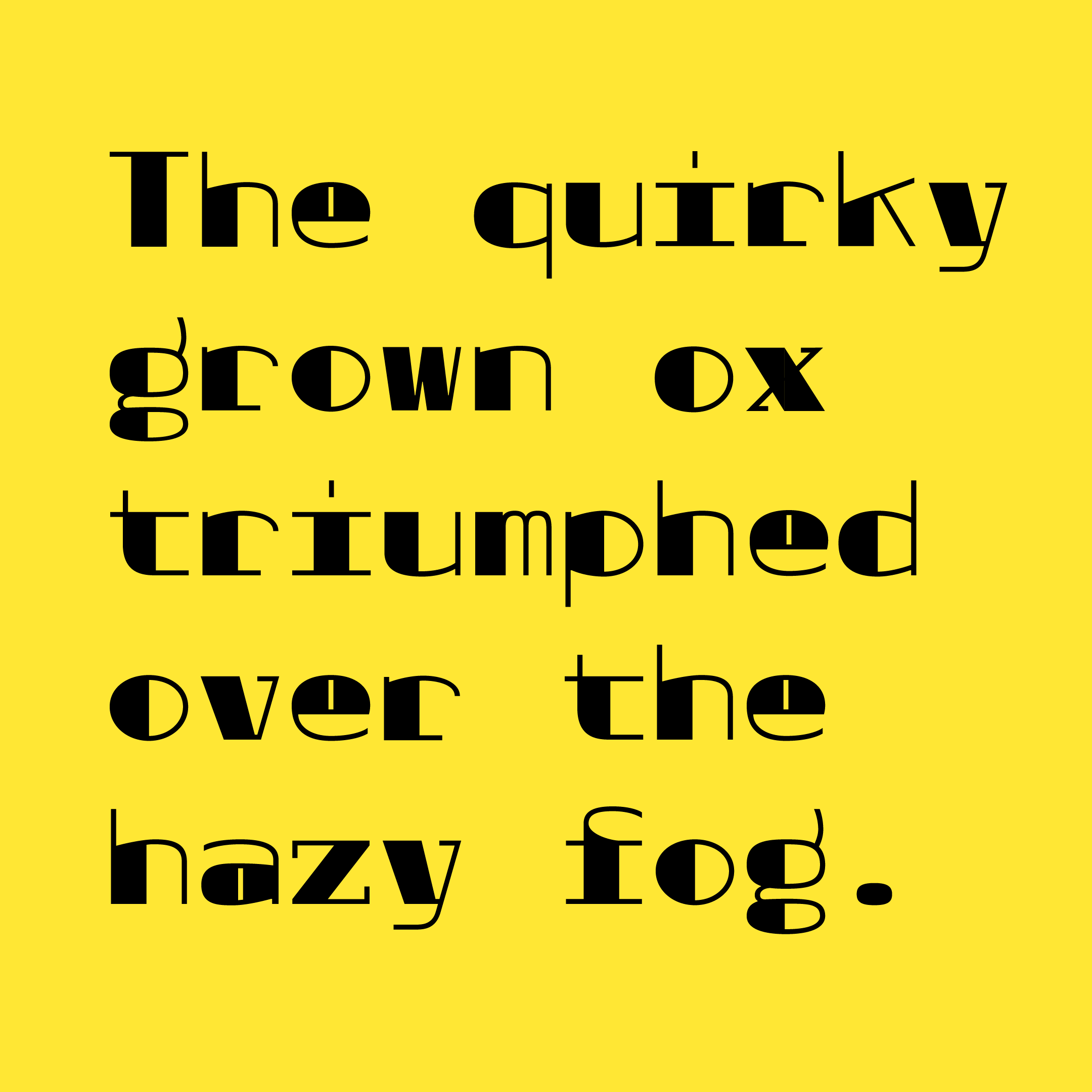
Inside the family-work-time paradox, for me, this additional learning or creative commitment is about honestly setting goals and intentions. Being kind to myself as a caregiver and creative, I didn’t expect to create a life-changing thesis for publication in two weeks or twelve. I even added the constraint of building a monospace typeface as a formal exercise to limit my possibilities. I wanted to practice the tools, practice practicing, to harness the process so that I may continue to tinker more effectively, one day, project, or idea at a time.
Get to class
The class setting is a thing. It’s not the only way to learn, but it's a worthwhile one. Seeing the struggles and successes of others. On Zoom or, however. It’s not exactly exchanging manifestos at the cafe, but it is communing. Baptizing yourself in the doctrine of the teacher’s logical and practical pitch, including how they see all the work put in front of them. Trust. Learn the rules to break them—that whole thing. Also, accountability. A helpful ante-up for any attention-deficit parent with a strong pull in many directions.
Better not best
The smartest person in the room? Give yourself a break. What a boring life that would be. You just walked into a new room you’ve never hung out in. Cool things on the walls. The people all have something in common. You can SHHH and listen for a bit. That’s refreshing, no? It’s the influence of others, plus your unique perspective, work, and time, that will make your efforts meaningful.
Talent is completely overrated, but what is consistently undervalued is the curiosity that drives exploration and experimentation.”
Better methods
Build good habits. Learn how to look and assess better: to walk around your work and kick the tires methodically, objectively, or at the very least somewhat open-mindedly so you may learn past what you knew when you started. Move the needle. Shave time where you can so you can use it better. Robofont was the class platform of choice. Within the application, Space Center is a dedicated window for previewing text and adjusting the glyph metrics in a font. It offers great features for visually evaluating your work in different ways.
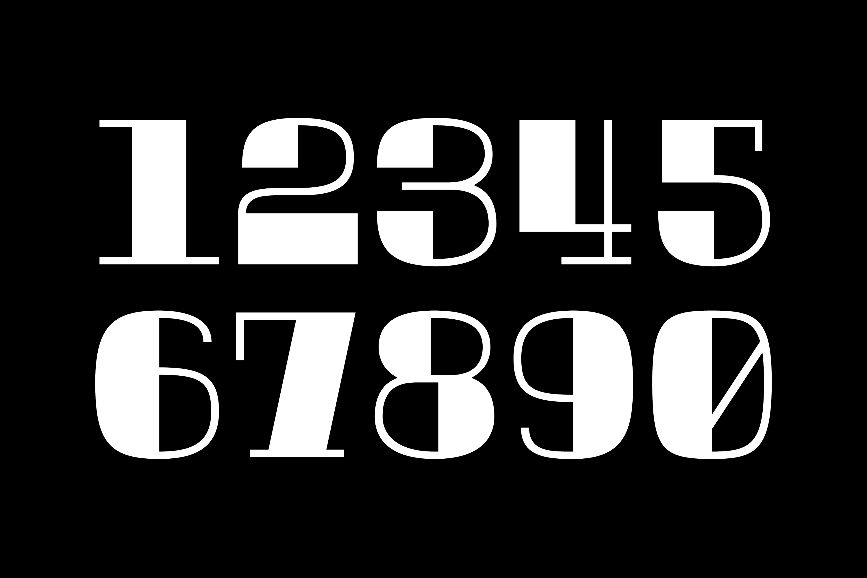
Invert your work to see anew. Looking at the negative ground helps stress test how the forms perform.

A/B/C/etc alternate designs. Evaluate and eliminate options. Then try in context.
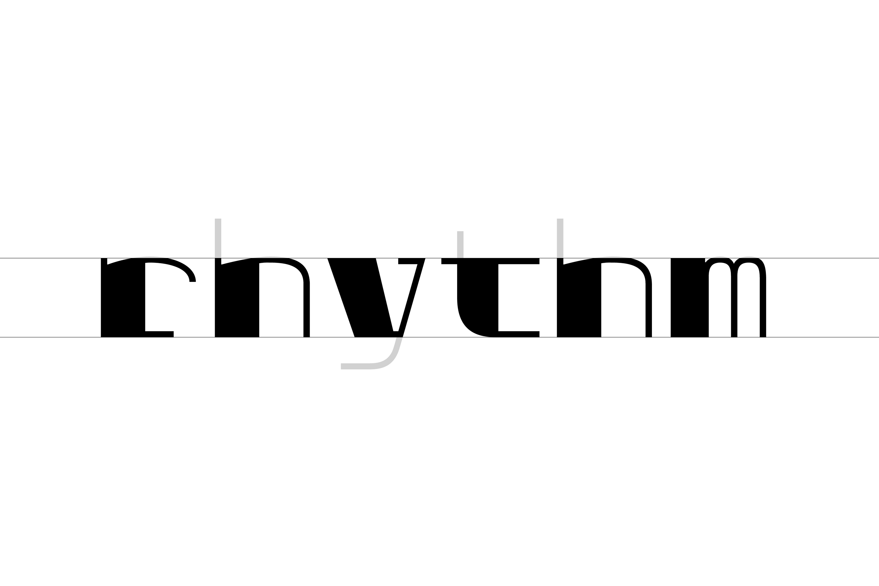
Compare like parts. Isolating x-height in type forms helps better judge overall balance and spacing.
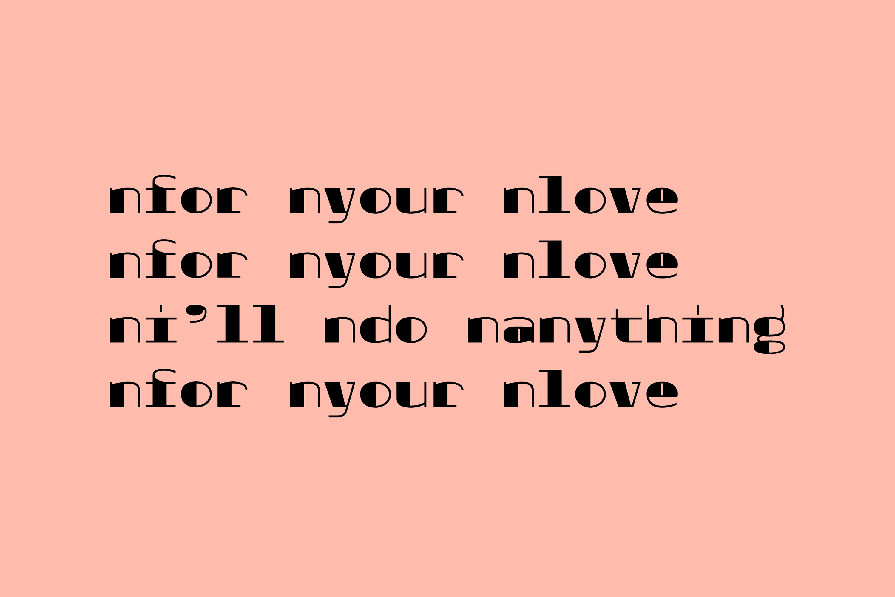
Evalaute against a constant. The character 'n' is a helpful, common comparison for most other letterfoms.
Credits
[CURRENT]/[TOTAL]
Young talent alert!
They are out there. With sweet ideas and maybe even a finer craft at younger ages than myself or my peers when we were coming up. Touché. It tells us something about time, technology, and maybe the changing broader awareness of type in our lifetimes. Instead of a quality digital cut choice of Helvetica, Futura, Akzidenz, Avante Garde, or Avenir, you can choose… well, from hundreds of dialed-in, individualized, sans-serifs, fit and even flexible (variable) for your brand program. More talent learning from more talent more quickly, creating many choices to celebrate.
Share your struggle
Take a penny, leave a penny. Your work isn’t for everyone. You may not even be sure if you like it yet. But some of your group are more like you than the others, learning from your formal journey. Maybe they found a crucial tip to save them a huge creative pothole later. Or perhaps a single detail in your work inspired them to think about a few new curves of their own.
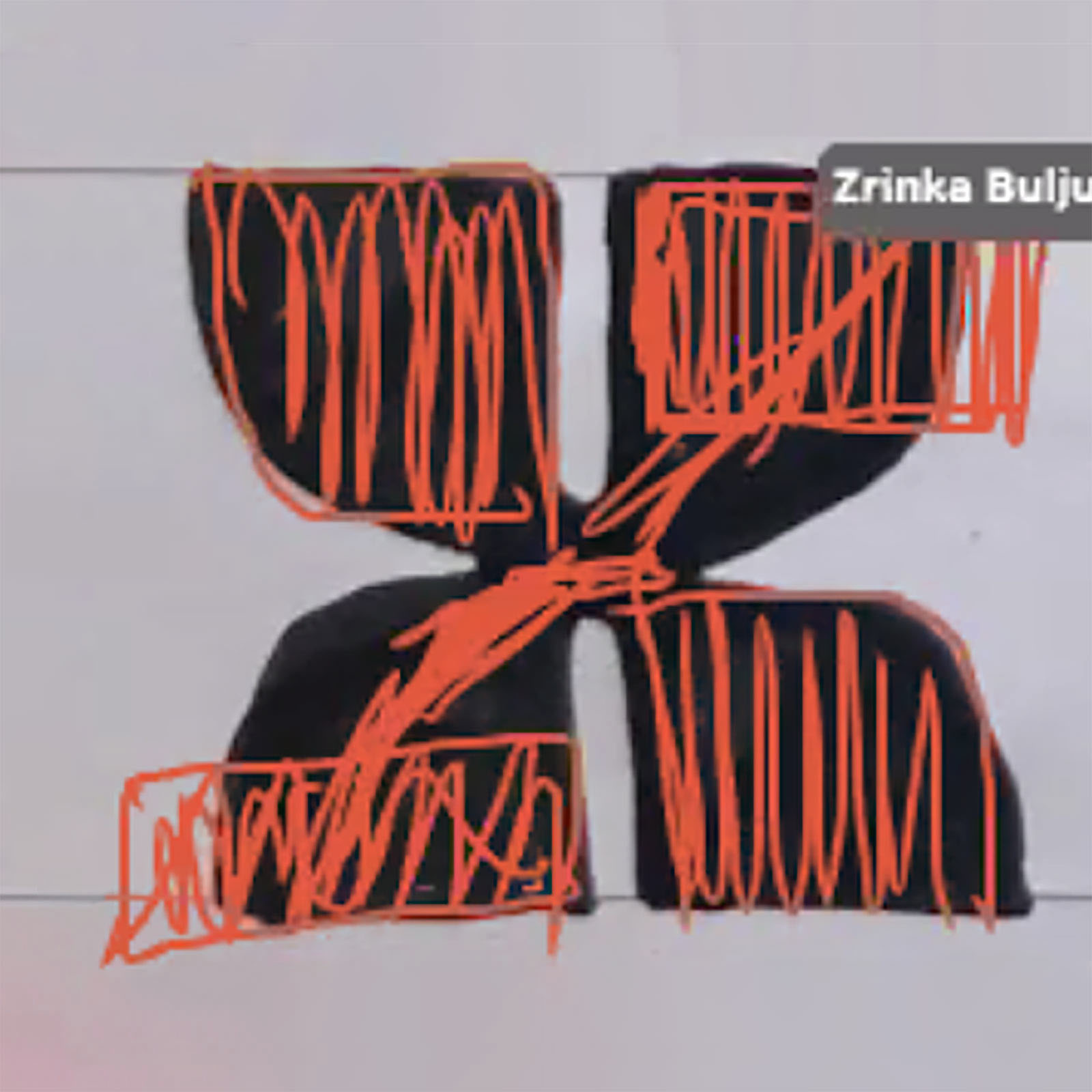
Work is the reward
Starting is always hard. Starting a class, starting each new day that you sit down. Doing the work sometimes feels like practicing re-starting over and over again. Engaging with the problem—it’s meditation. It’s pure faith for the creative zealot. It’s where you learn. It’s you at your most vital, creatively doing and questioning; melding your task at hand with all of your inherent individualistic humanity to inform how you solve the problem.
Struggle is valuable
One day, you may ask a pro for tips on how to really get after something you’ve been grinding or DIY’ing on, to find them describing concepts, considerations, or processes you’ve already internalized or learned by doing. Confirmation. You’re a promising novice, not a hack. You found the path on your own. The work pays off. Hold your head up. Don’t be afraid to be a professional amateur. It may clear a path towards a new specialty. At the very least, it may just help you do your job better. Others may even be paying attention, taking joy, or taking inspiration from your work.
Other Links
Getting Started with Type by Oh No
Typeface Mechanics 01 & 02 by Frere-Jones
Robofont Space Center
Getting The Most Out of Robofont by Arrow Type
